Background
An Ontario-wide bus line that has established routes along the Quebec City to Windsor corridor (and points in between) to fill in the gap left when Greyhound bus lines pulled out of Canada.
Trillium Bus Lines is a recent blooming bus service provider, we love to facilitate our travelers to have their best experiences and have incredible memory.
This is a school project Trillium Bus Lines for I did as UX Design student. It is an individual project meaning I did all the work from research to design by myself. Trillium Bus Lines is a frictional company. The project is supervised by Ronil Upadhyay and in this case he was the “project manager” for any feedback.
Project Goals
The goal of the project is to understand the business goals and create a website design to accommodate the new train line as well as revamping the website for the company. The project will cover research, design and a high-fidelity interactive prototype.
There are some common business goals will need to be achieved with the new design.
1. Increase tickets sales
As a business, it will be one of the main goals to increase ticket sales. Having the website, should allow travellers to find their tickets more easily and purchase online with self-service. The tickets catalogue allows users to search for tickets easily. It will have places for the users to explore so they can have more ideas on where can they travel to.
The website also allows more exposure so that users from all over the world can get in touch with the company and purchase the tickets instead of just having local users.
Since the Greyhound bus line pulled out of Canada, the company will absorb the routes along Québec City to the Windsor corridor (and points in between) to fill in the gap left. It will dramatically increase the sale, it will be a first priority to make sure this route is prominent to users and easy to find.
2. Promote brand image
As a business, we need to make sure the company has a good image to gain return customers and expose the brand to more people.
Having a positive image for the brand is always good to promote the brand and get more support from other companies or people to join the company.
We will need to provide more information about the services. It should provide customers with information to understand the company.
3. Reduce Operation Cost
We want to reduce costs by providing self-service to purchase tickets online. We would like to also answer frequently asked questions.
We aim to reduce unnecessary costs such as hotline services, so we can use the cost to provide better service to our customers such as better seats and more routes.
We would make better use of the reduced operation cost. We would provide more value to the customers. We can occasionally give back to society such as providing training or workshops.
We can help connect the community and promote the beauty of travelling at a lower cost and exploring the world. We want to make travel as accessible as possible to everyone by reducing the cost and providing relative service instead of paying for customer services.
Research
Goals
In the research phase, I tried to understand the common features and target customers for the business. This project focuses on secondary research of a competitor scan. I found different potential competitors of the transport service providers. In this stage, the goal will be to find some common practices, features and layouts. I checked out each competitor based on a list of criteria, and seek what opportunities we can have for the business.
Methods
Persona
Personas are created based on research and data collected from real users, and they help to create a more concrete understanding of the users’ needs, motivations, goals, and behaviors.
The primary reason for creating personas is to build empathy and understanding for the users, which allows designers and developers to make better decisions when designing products or services. By understanding the users’ goals and needs, designers can create a user experience that is tailored to their specific requirements and preferences, leading to a more successful product.
Personas also help to align the team around a shared understanding of the users and their needs, reducing the risk of assumptions and biases that can lead to poor design decisions. They provide a common language for discussing user needs and preferences, which helps to facilitate collaboration and communication between different stakeholders.
There are some potential personas such as
- Students
- Low on budget
- Travel on holidays
- With friends
- Business Traveler
- Time is money
- Work while they commute
- Have a busy schedule
- Backpackers
- Simultaneous
- Adventure
- Get on the next bus
These personas have different moral models and motivations. Due to the project scale and time, this project focused on the business traveller as the primary persona for design.
This persona was created to be used throughout the design process to make sure the design is solving the pain point of the person. It helped to keep me on track during the design of user flow as well as the features.
Scenario
A scenario has been made to be followed when doing the user flow design and testing.
It is a narrative description of a user’s interaction with a product or service, typically used in the context of user-centered design. It describes the user’s goals, motivations, and tasks, as well as the context in which they are using the product or service. It includes include details about the user’s environment, their emotional state, and any obstacles or challenges they may face.
It helped me to understand the user’s perspective and to identify potential usability issues or design opportunities.
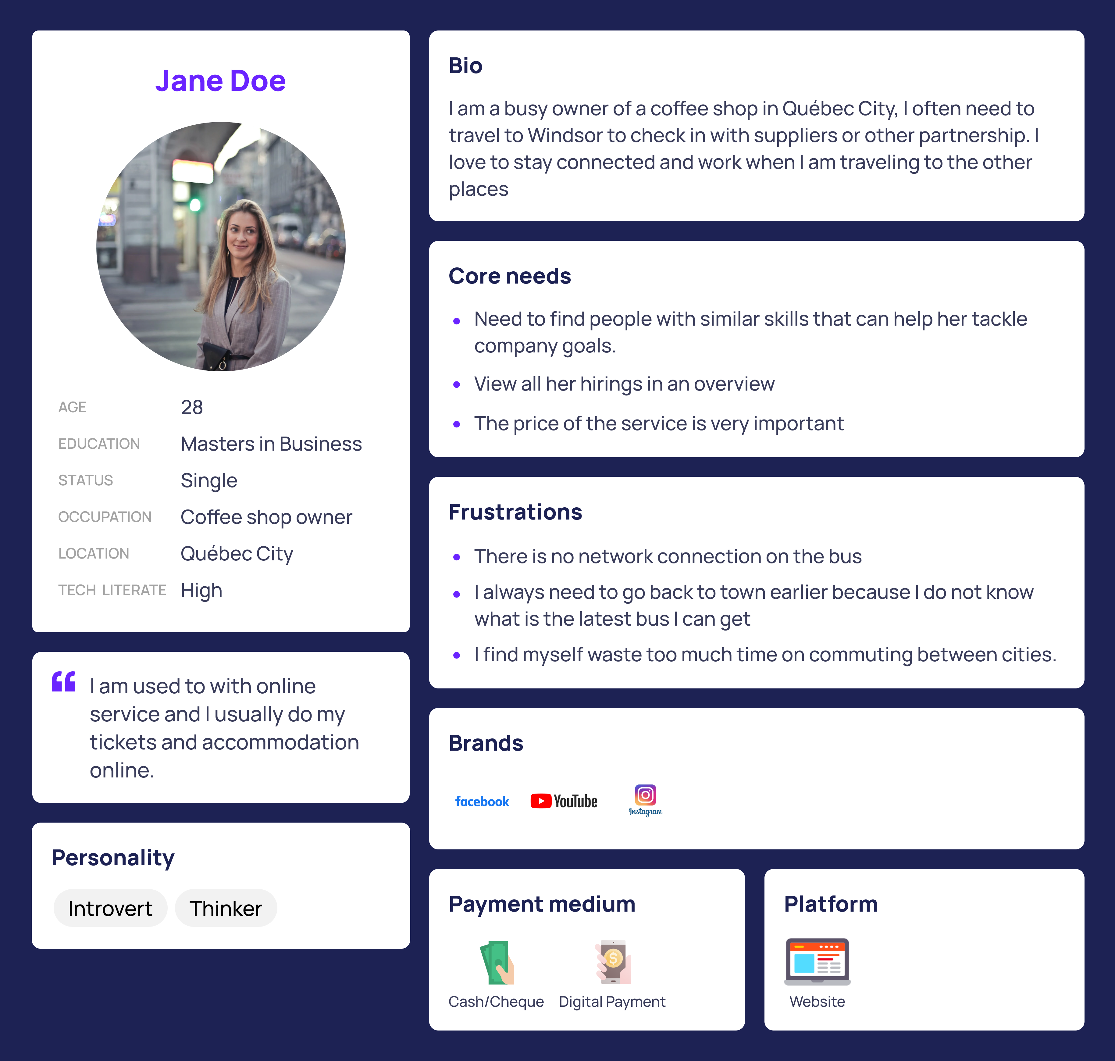
Jane Doe is a very busy businesswoman who owns a coffee shop. Her main company is based in Québec City. She needs to travel to Windsor by bus because she is not a big fan of trains. She is looking for a ticket to get to Windsor as fast as possible before the day of her pop-up store event takes place. On her way back she prefers to make use of most of the time before getting back to Québec City. She would like to jump on to work with her laptop on her way back to Québec City on the bus.
Competitors Analysis
In this phase, I visited different similar sites and learn how the competitor solve similar problems to understand the positioning and the trends. On every website, I tried to take every chance to create an account, search for a ticket, and purchase a ticket up until the payment step.
The goal of this competitor research is to gain insight into how to differentiate one’s own products or services from those of the competitors, and to identify opportunities to gain a competitive advantage.
There are some criteria, I followed to make sure I covered enough of the website.
- Features
- Home Page
- Payment Flow
- Search Ticket Flow
- My Account Page
- Layout
- Information Architecture
Busbud
It is a website include all the bus providers and sell tickets as third party
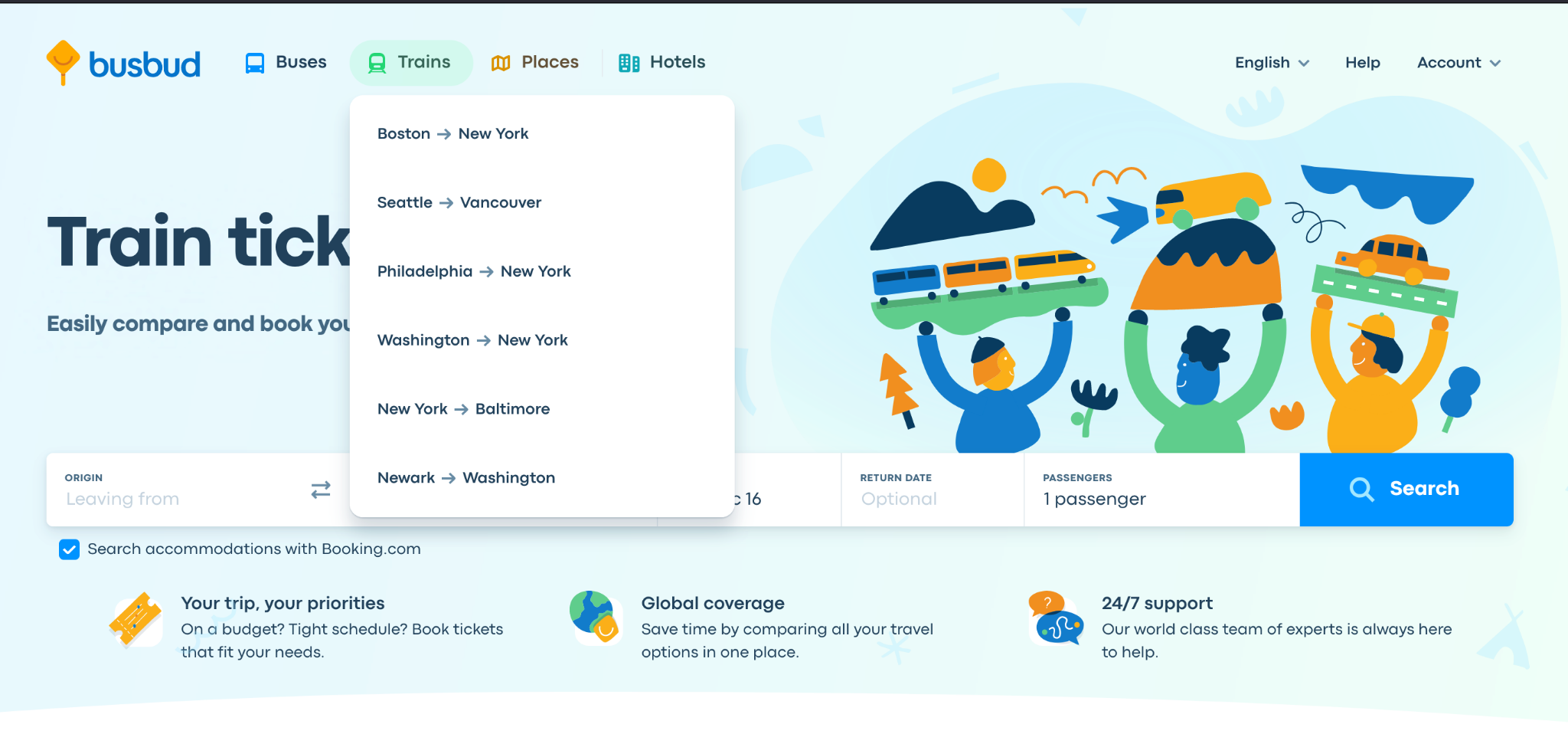
(Image: Busbud Home Page)
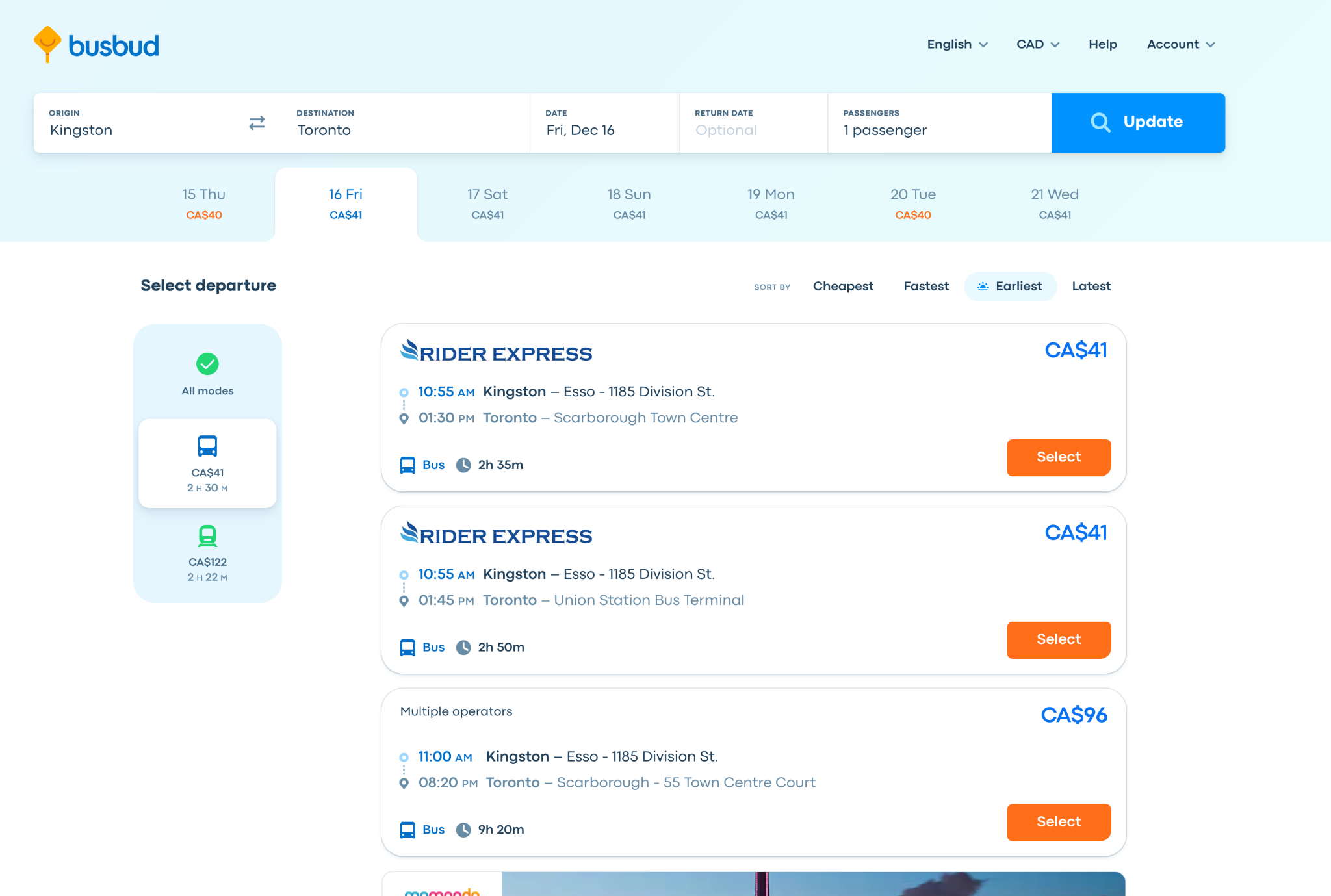
(Image: Busbud Tickets Page)
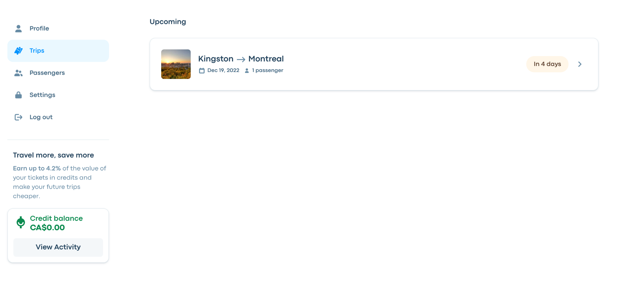
(Image: Busbud Trips Page)
Megabus
They operate their own bus and sell tickets on their website
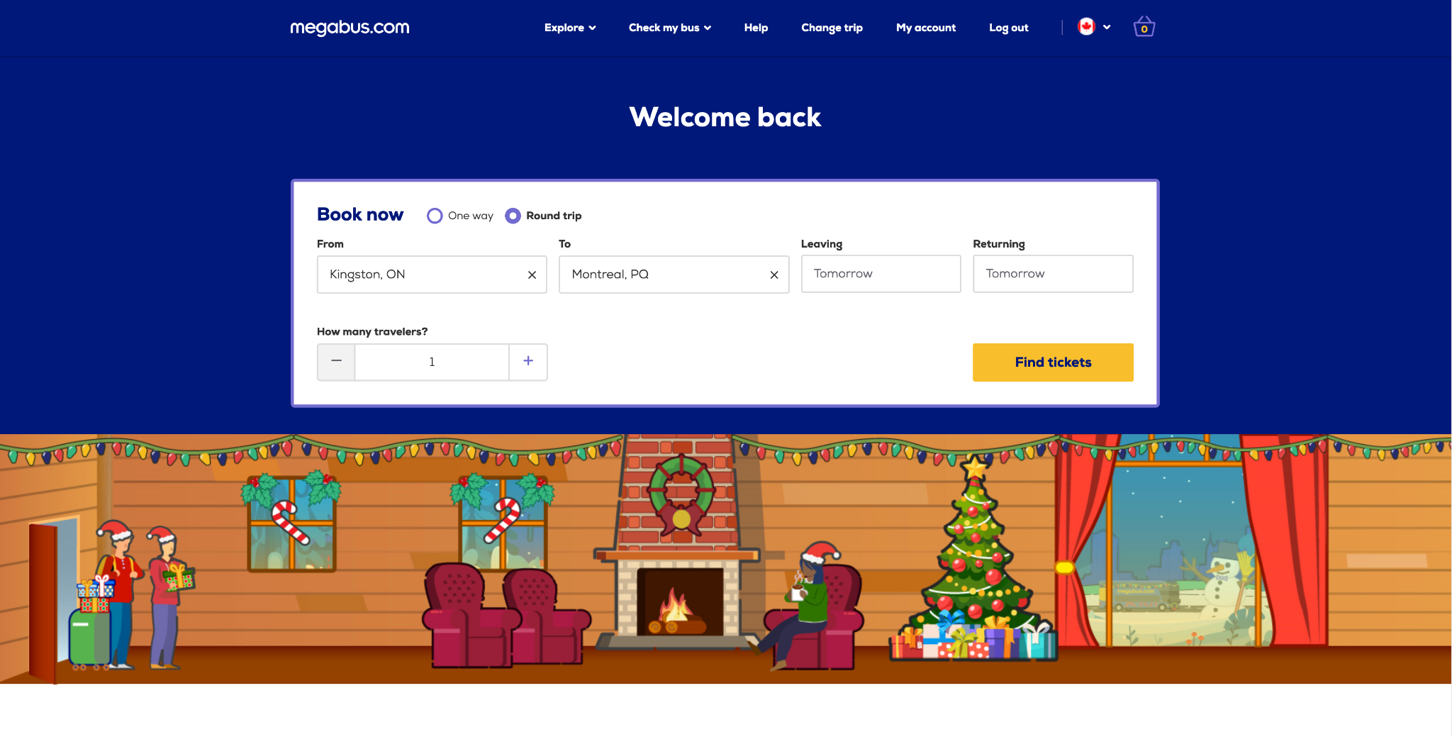
(Image: Megabus Home Page)
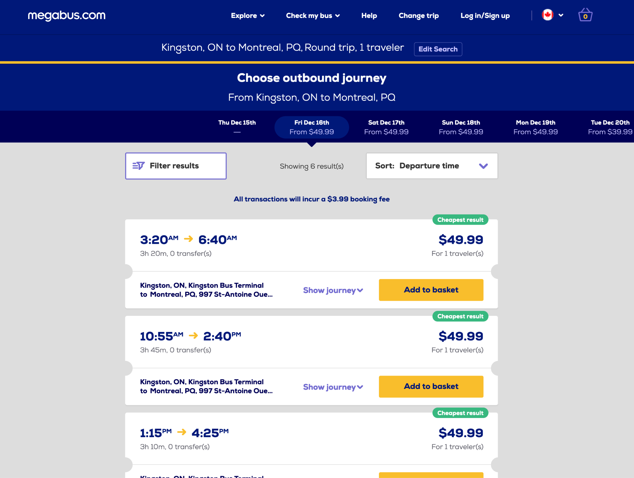
(Image: Megabus Tickets Page)
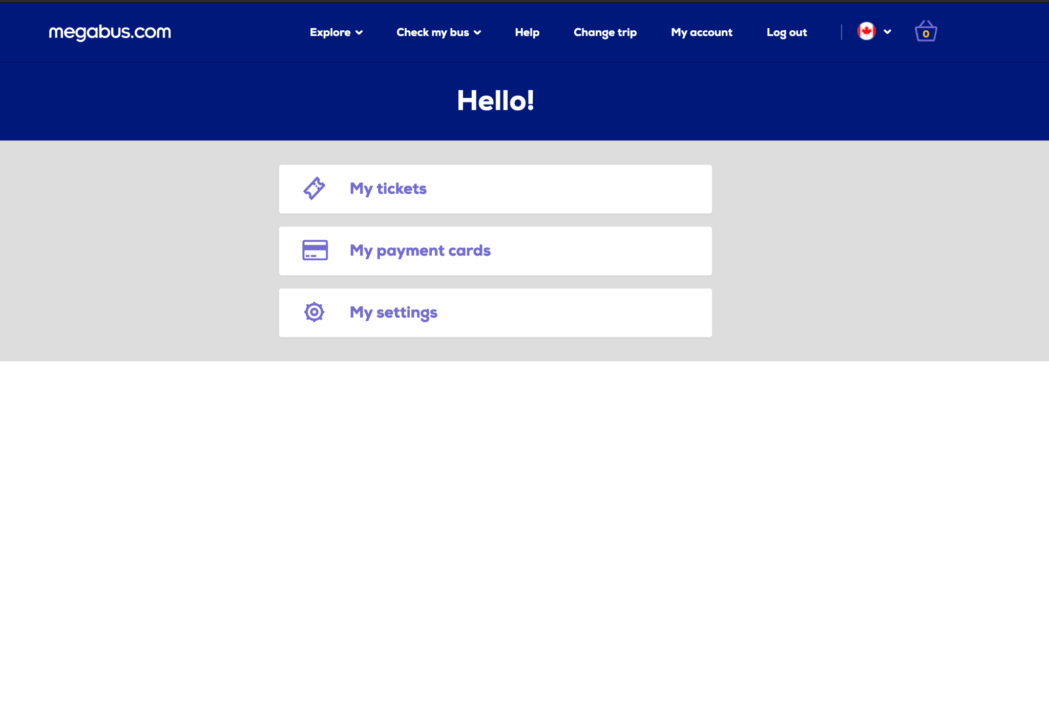
(Image: Megabus My Account Page)
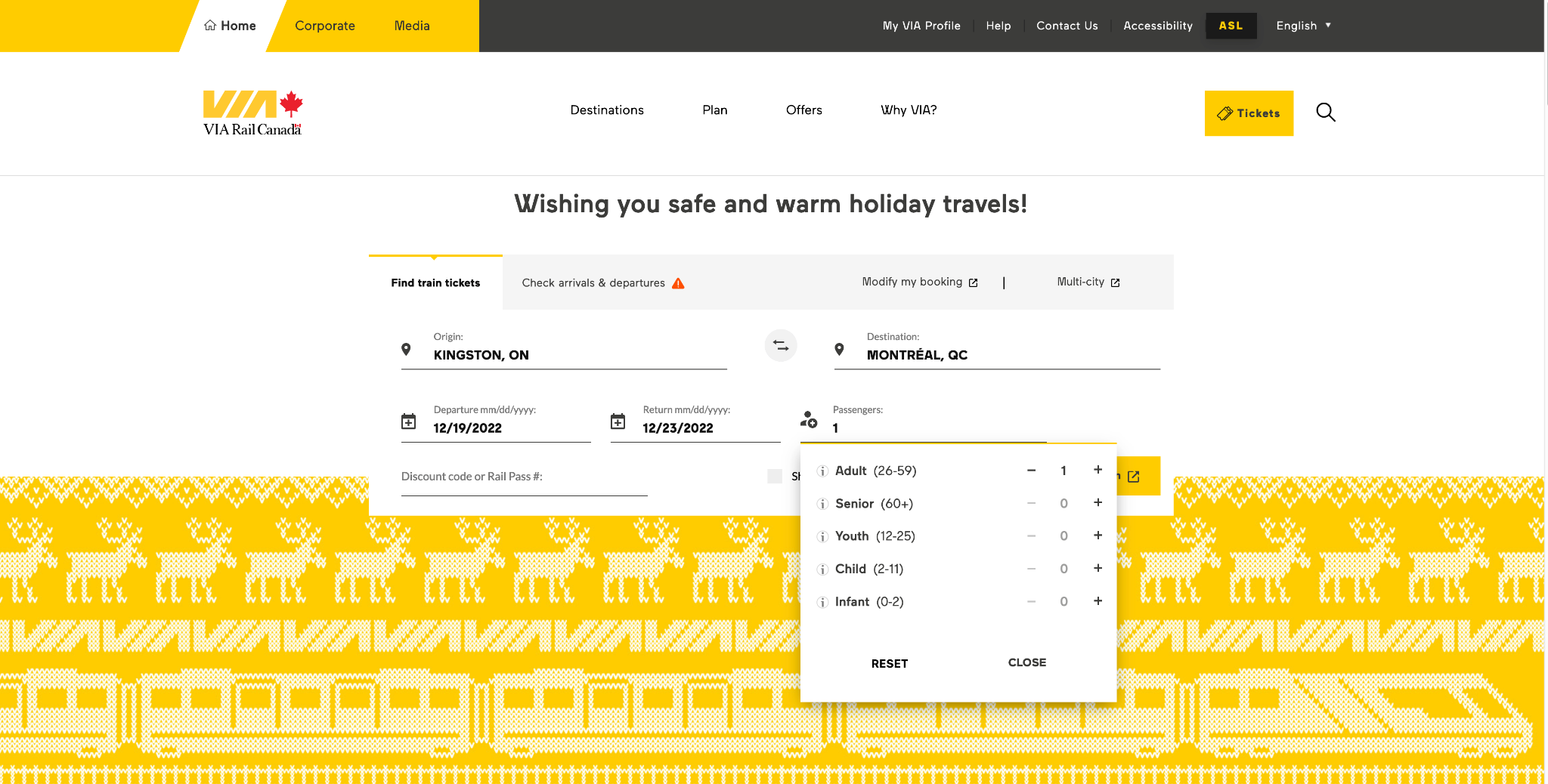
VIA Rail
It is a train service that covers most of transportation in Canada
(Image: VIA Home Page)
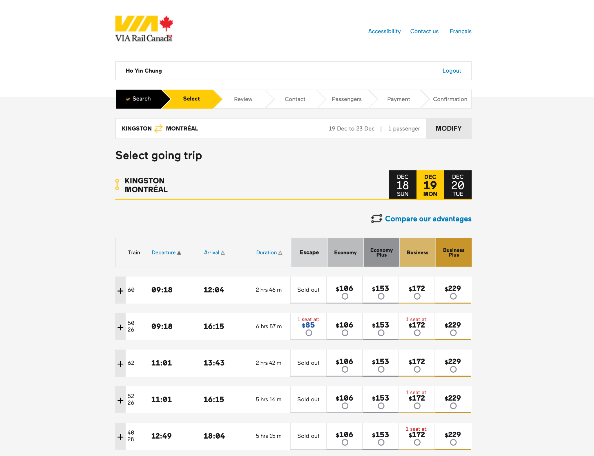
(Image: VIA Tickets Page)
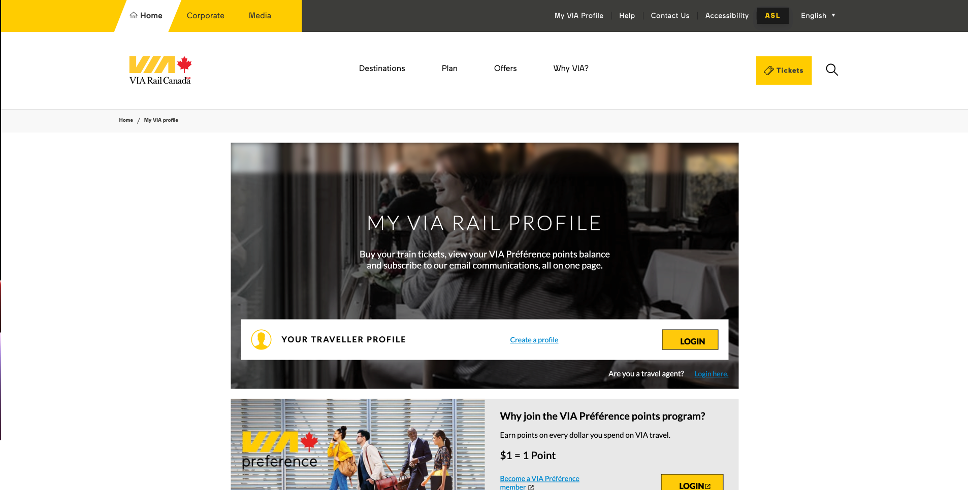
(Image: VIA My Account Page, Login In Page)
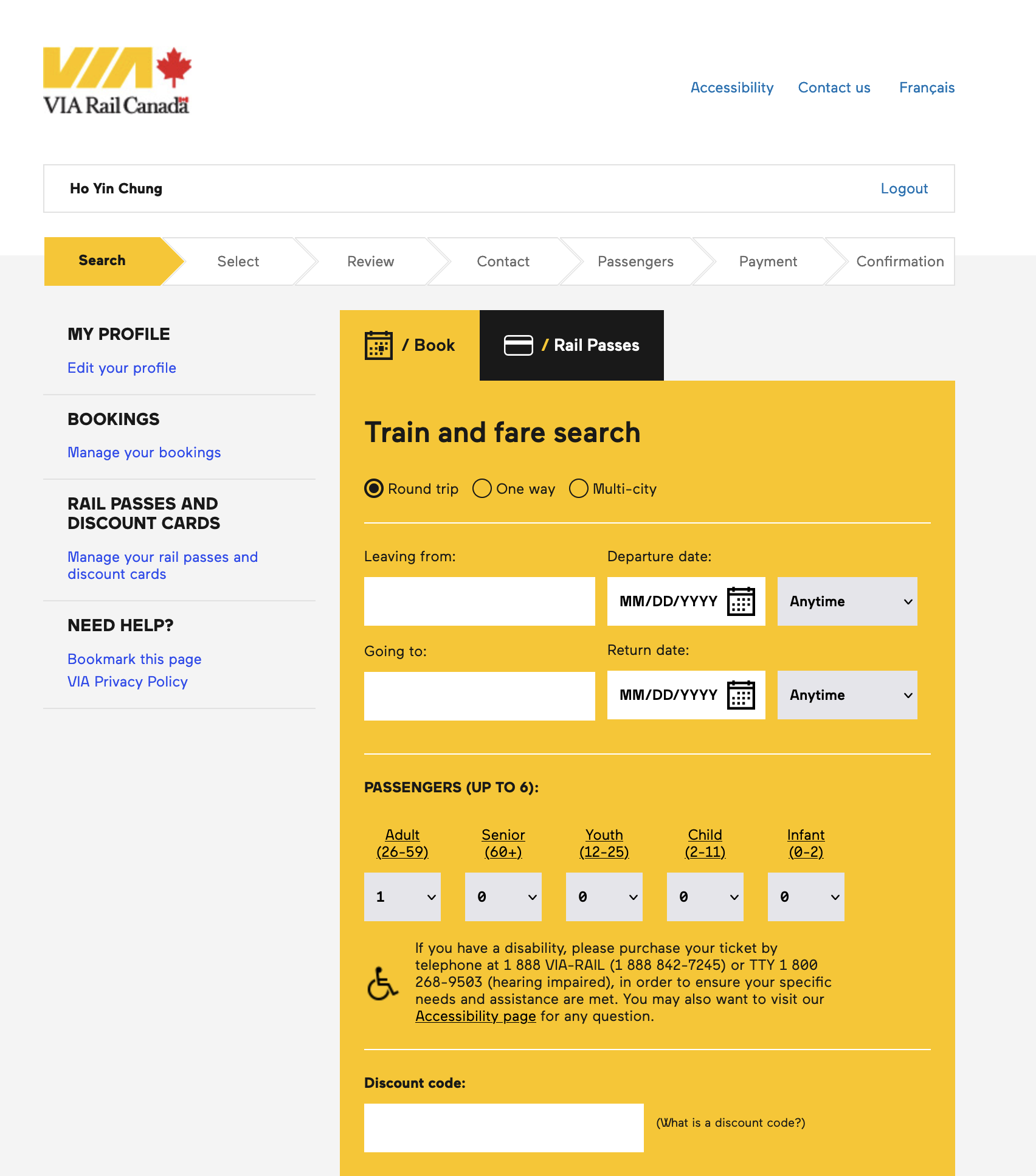
(Image: VIA My Account Page, Actual Page)
Coach Canada
It is website introduce the bus service, they redirect to the actual provider for ticket selling
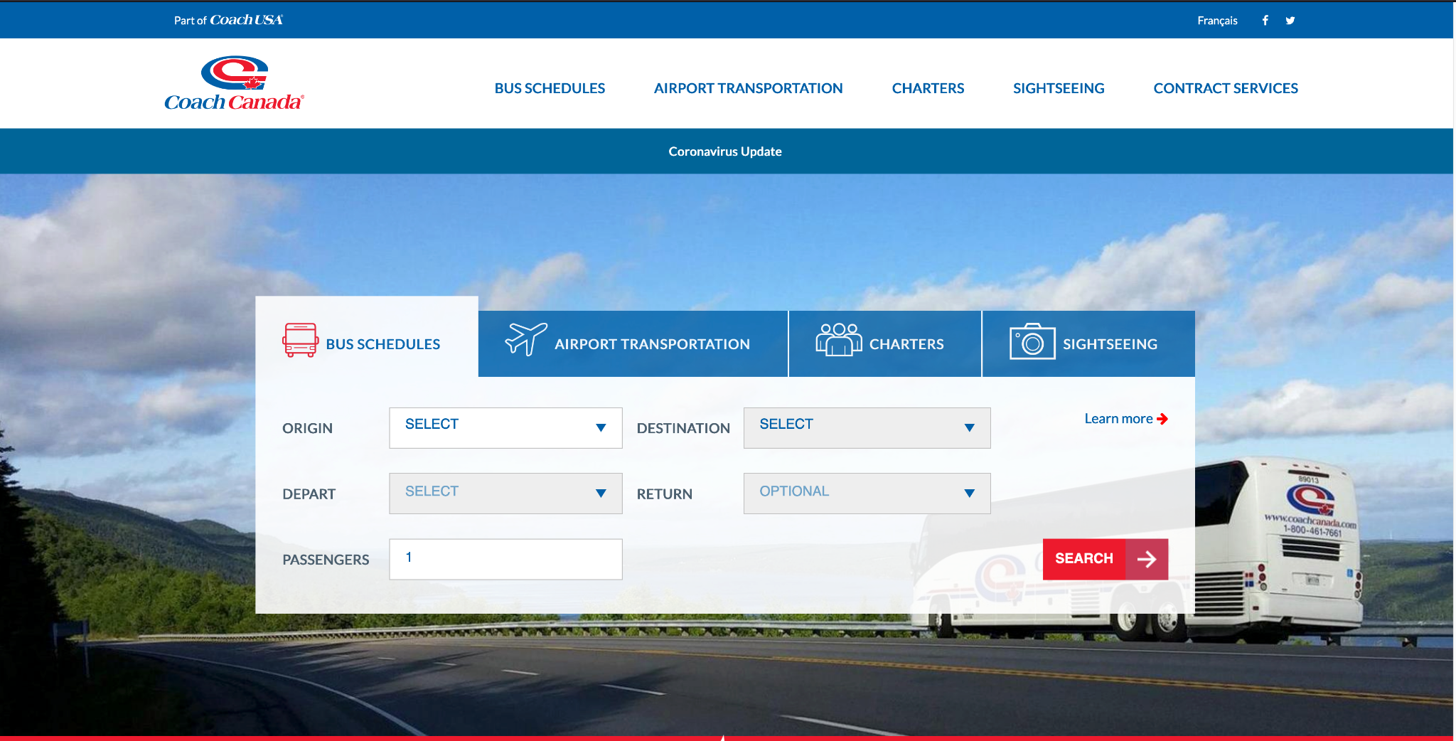
(Image: Coach Canada Home Page)
| VIA Rail | BusBud | MegaBus | Coach Canada | |
|---|---|---|---|---|
| Search Bar | ✔️ | ✔️ | ✔️ | ✔️ |
| Login Required | ✖️ | ✖️ | ✔️ | ✖️ |
| Trip History | ✔️ | ✔️ | ✔️ | ✖️ |
| Online Payment | ✔️ | ✔️ | ✔️ | ✖️ |
| Destinations | ✔️ | ✔️ | ✔️ | ✔️ |
| Routes | ✔️ | ✔️ | ✔️ | ✔️ |
What we might do?
- Search Box
- The search box shall serve as the quintessential component for locating tickets.
- The date picker and trip options shall prove indispensable to the user.
- The VIA Rail passengers picker shall be an excellent addition.
- Two Types of Flow
- There shall be a Select and Single Process for each trip.
- This shall preclude the user from having to begin anew should they depart the process.
- The user shall be guided in a step-by-step fashion.
- An Add to Cart feature shall be included for multiple trips.
- This shall permit the user the liberty to exit the ticket selection process.
- Multiple trips may be purchased at once.
- Clean vs Detailed main pages
- Certain home pages are minimalist in design, with all pertinent information situated in the periphery.
- The navigation and titles must be lucid to facilitate user orientation.
- This approach engenders a pristine aesthetic that accentuates the primary content.
- Conversely, some home pages are rather intricate and exhibit copious amounts of information.
- This may not be readily apparent to the user and may potentially cause them to feel overwhelmed.
- My Account page
- We must ensure that the My Account page is featured on the same website.
- To enhance user accessibility, a Two Panel Layout may be employed to facilitate content viewing.
- We may desire to constrain the page to a maximum of two levels.
- Checkout process
- For guest checkout, passenger information is generally required.
- Frequently, the checkout process mandates that the user log in prior to checkout, which is a policy we endorse to optimize the customer experience.
IA Diagram
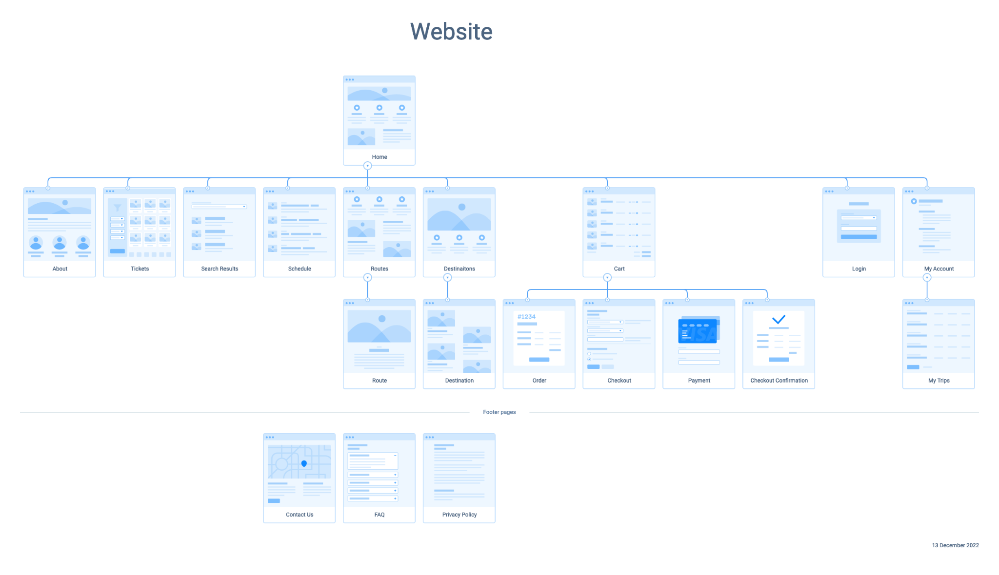
I created an IA Diagram based on the competitor research by finding the common terminology as well as their navigation.
Design
Design Patterns & Guidelines
I followed some design patterns & guidelines in this project to make sure the design process is smooth and the quality is up to certain standard.
- Atomic Design1
- Bottom-up approach
- Build from small elements to larger ones
- Group elements by artboard
- Pages elements are not being created as Adobe XD use the pages as single element already.
- Material Design V32
- Material Design is an adaptable system
- Guidelines, components, and tools that support the best practices of user interface design.
- Developed by Google
- checklist.design3
- Keep track on the design process
- Cross-check on the elements that I built
- Selected checklists are being used
Low-fidelity Prototype
- The Low-Fidelity Prototype will focus on building components, page layout, and interactions
- Colors will be used for buttons, and images, icons, and text content will only be added if they serve as labels or have significant meaning for the content
- Using placeholders for some text content, such as “CITY,” will reduce cognitive load for designers and reviewers, and make it easier to edit the design
- The unique design elements include buttons of different shapes to emphasize their distinctiveness
- The initial design will be presented, and the user flow will be discussed in greater detail in High-Fidelity Slides.
Base Components
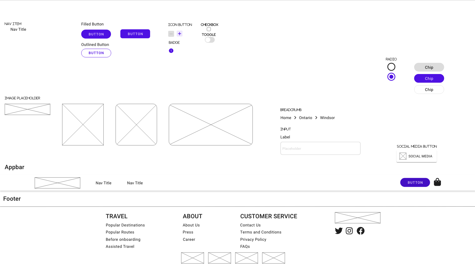
- Foundational components have been crafted for effortless user interactions, such as navigation items, buttons, and checkboxes.
- These serve as the building blocks for constructing larger molecules and components, as mentioned in the esteemed Atomic Design philosophy.
- The Appbar and Footer represent essential layout components, designed to elegantly frame any content.
Search Bar Components
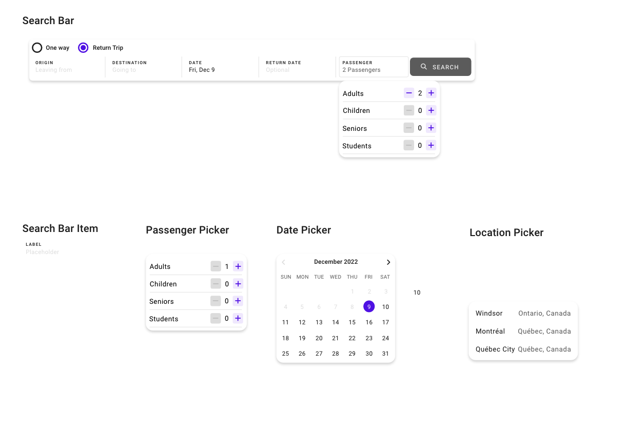
- The search bar components have been thoughtfully grouped to expedite discovery and implementation.
- Most of the items are pre-configured for the search bar and optimized for swift, intuitive user experiences.
- Dynamic content is elegantly presented, showcasing the innovative auto-fill feature.
- Departure and return dates are seamlessly synchronized, with return date availability based on the chosen Departure Date.
Ticket Components
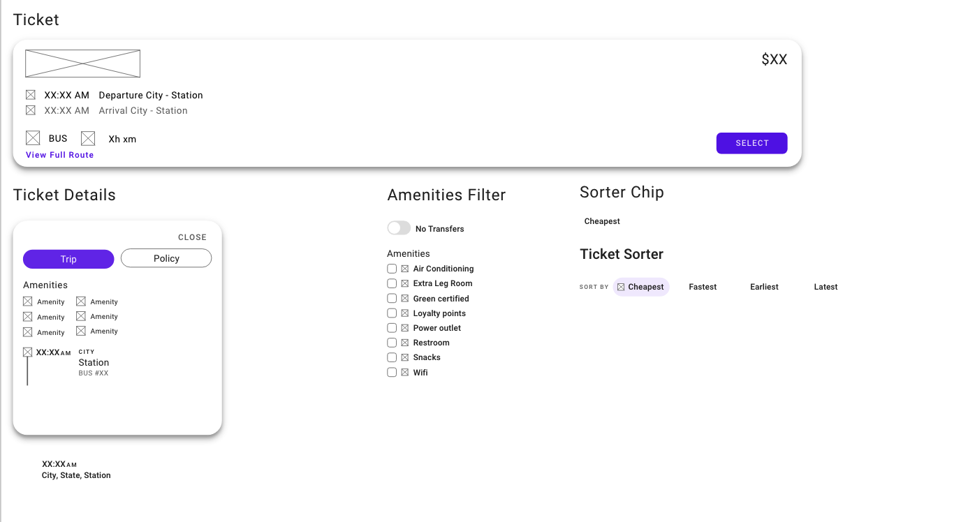
- Custom components have been meticulously designed for seamless integration with tickets and related content.
- These versatile elements are invaluable for crafting result pages, shopping bag displays, and My Trip pages.
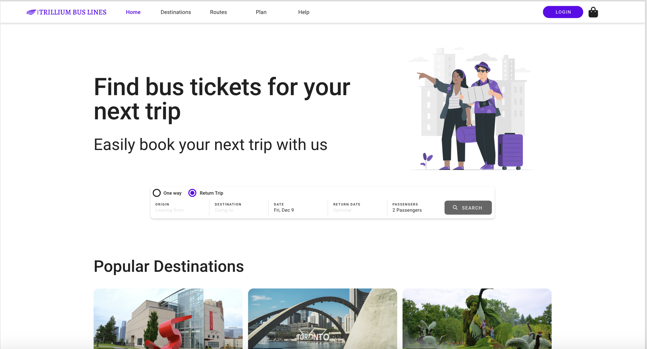
Home Page
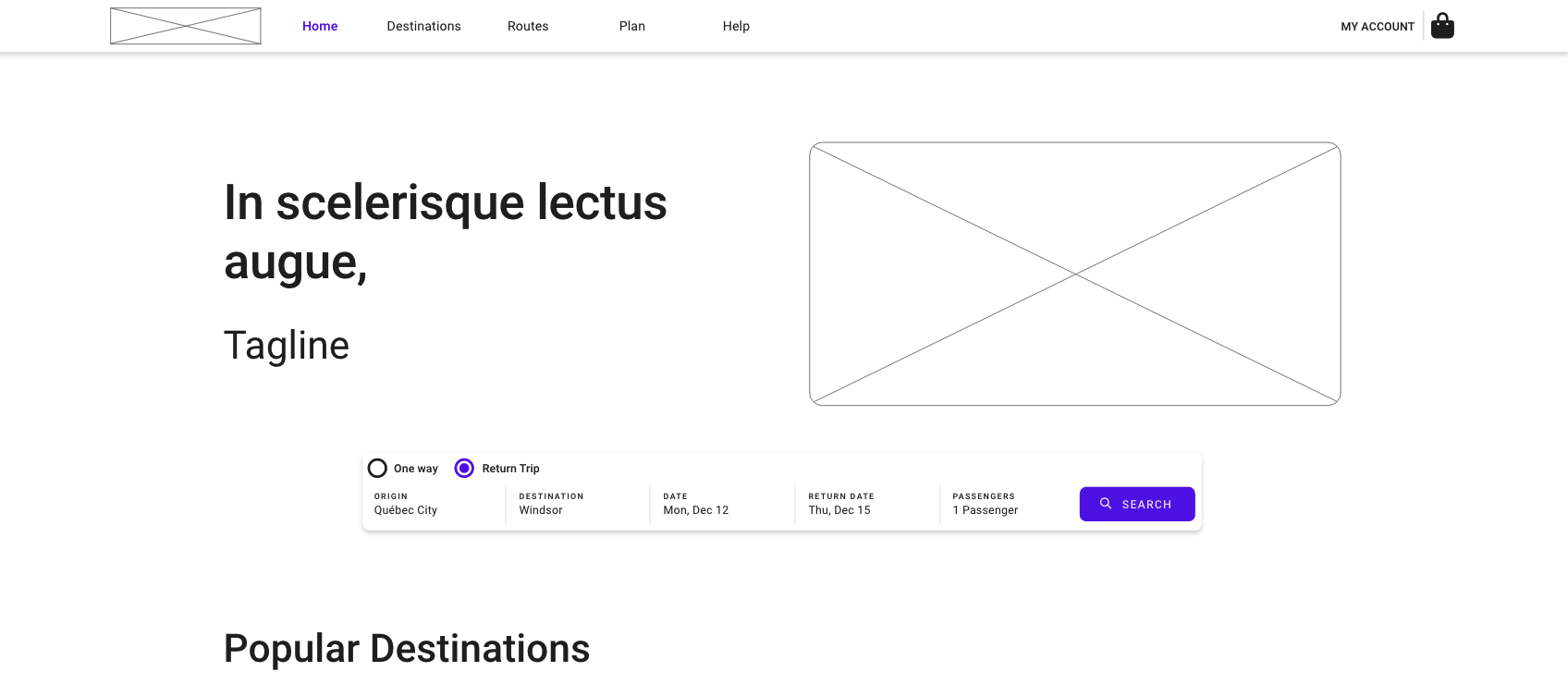
- Show the Search Bar Element
- Allow user to pick the origin and destination for tickets
- Input date for search
- Show Popular Destinations
Search Results Page
| Depart | Return |
|---|---|
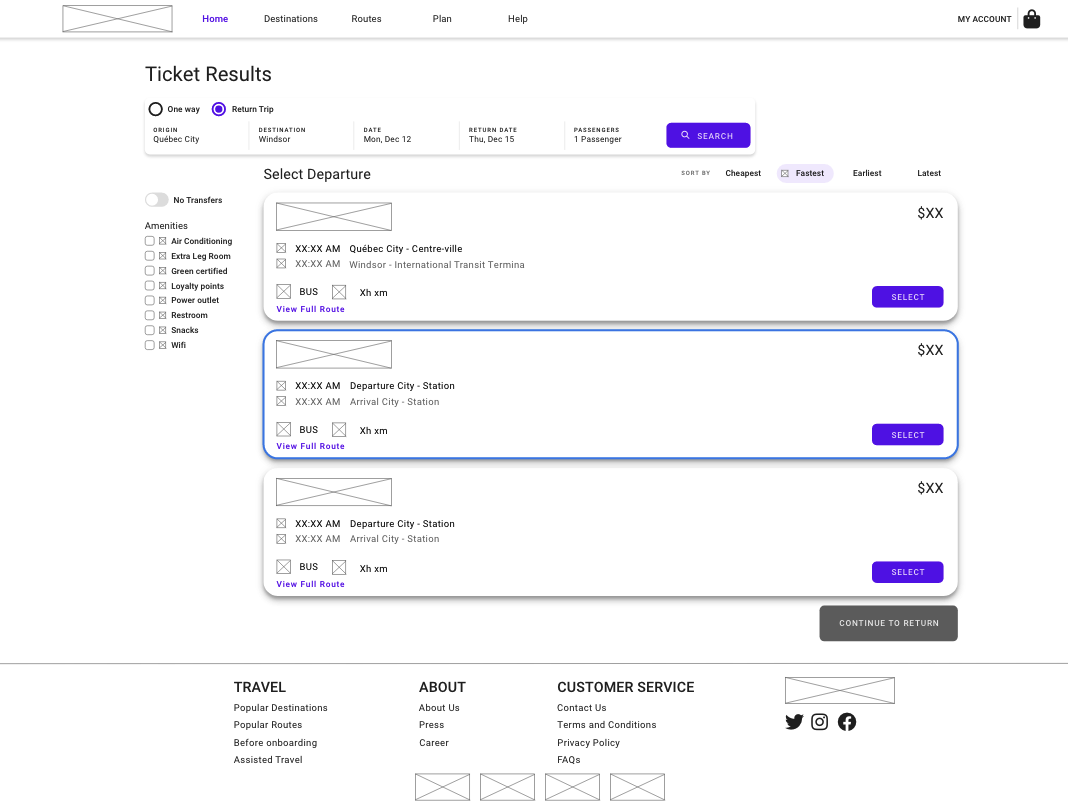 | 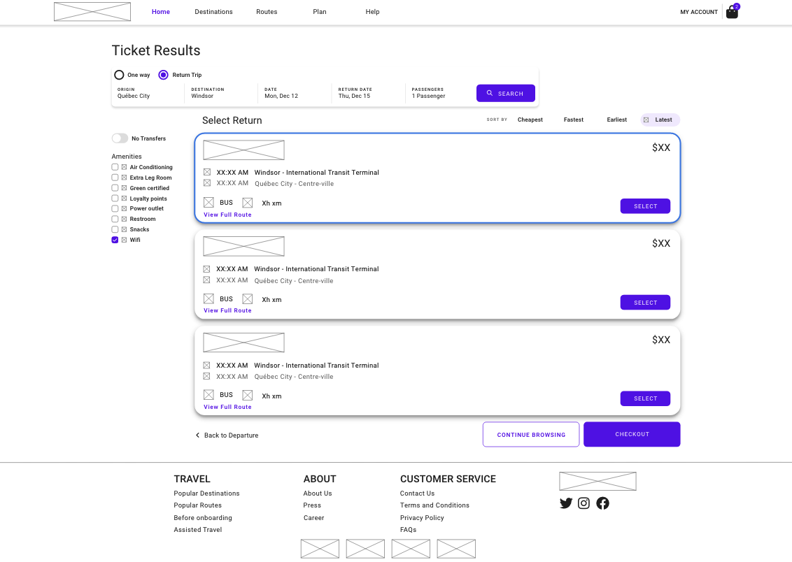 |
- It shows the results based on the search criteria
- Filter on left: Transfers & Amenities
- Sorting chips on top: Cheapest/Fastest/Earliest/Latest
- Price, time, estimated duration & route of the bus are shown individually for each scheduled bus
Shopping Bag
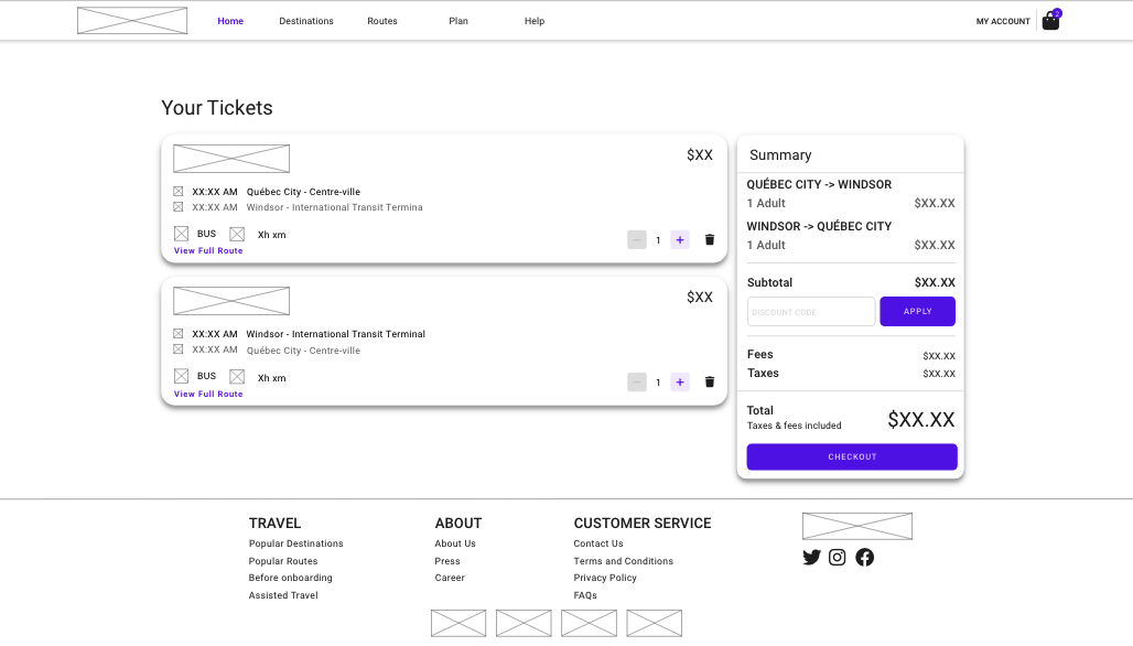
- Show the list of tickets to be purchased
- Edit the number of tickets
- Remove the ticket
- Apply Promotion Code
- Show subtotal, taxes & total
Checkout Pages
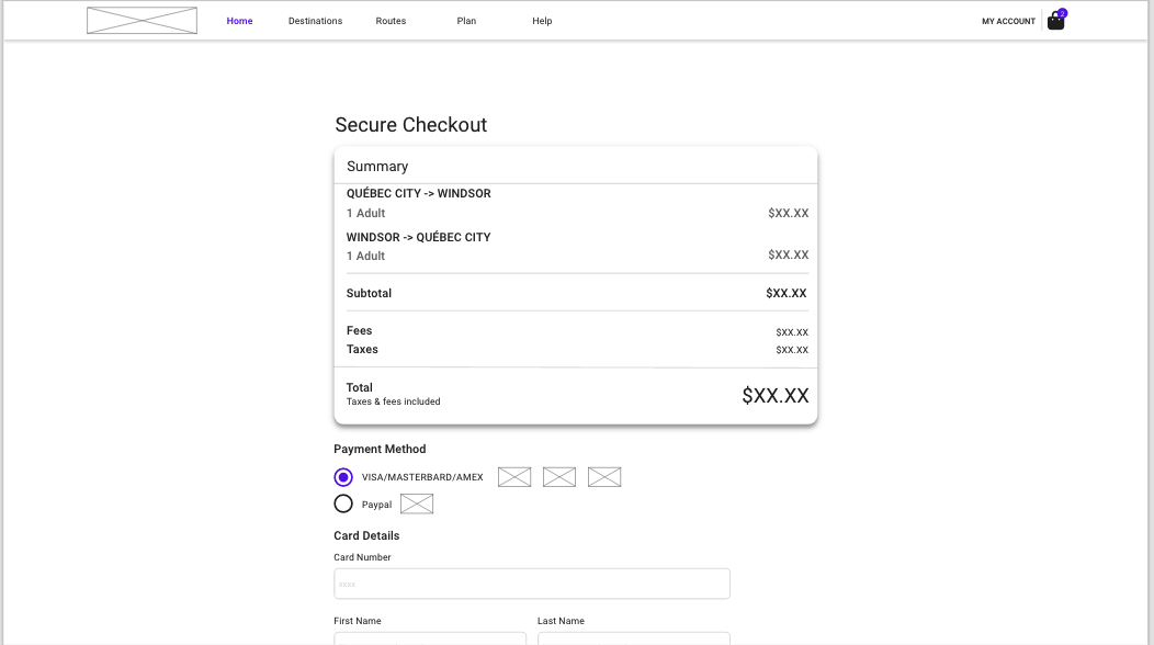
- The user will be shown the total of the tickets
- Select Paypal/Credit Card/Debit Card
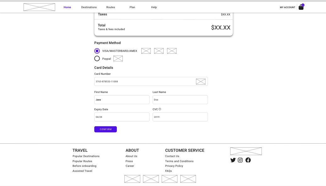
- Input all the details of the card which validation will be in placed
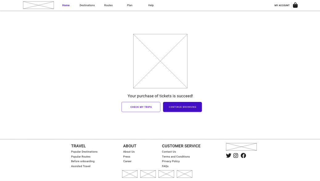
- Let the user know that the payment is successful
- Guide them to the my trips page
- Notify them that they can search for other tickets
My trips
| My Trips Page | My Trips Page with Pop up |
|---|---|
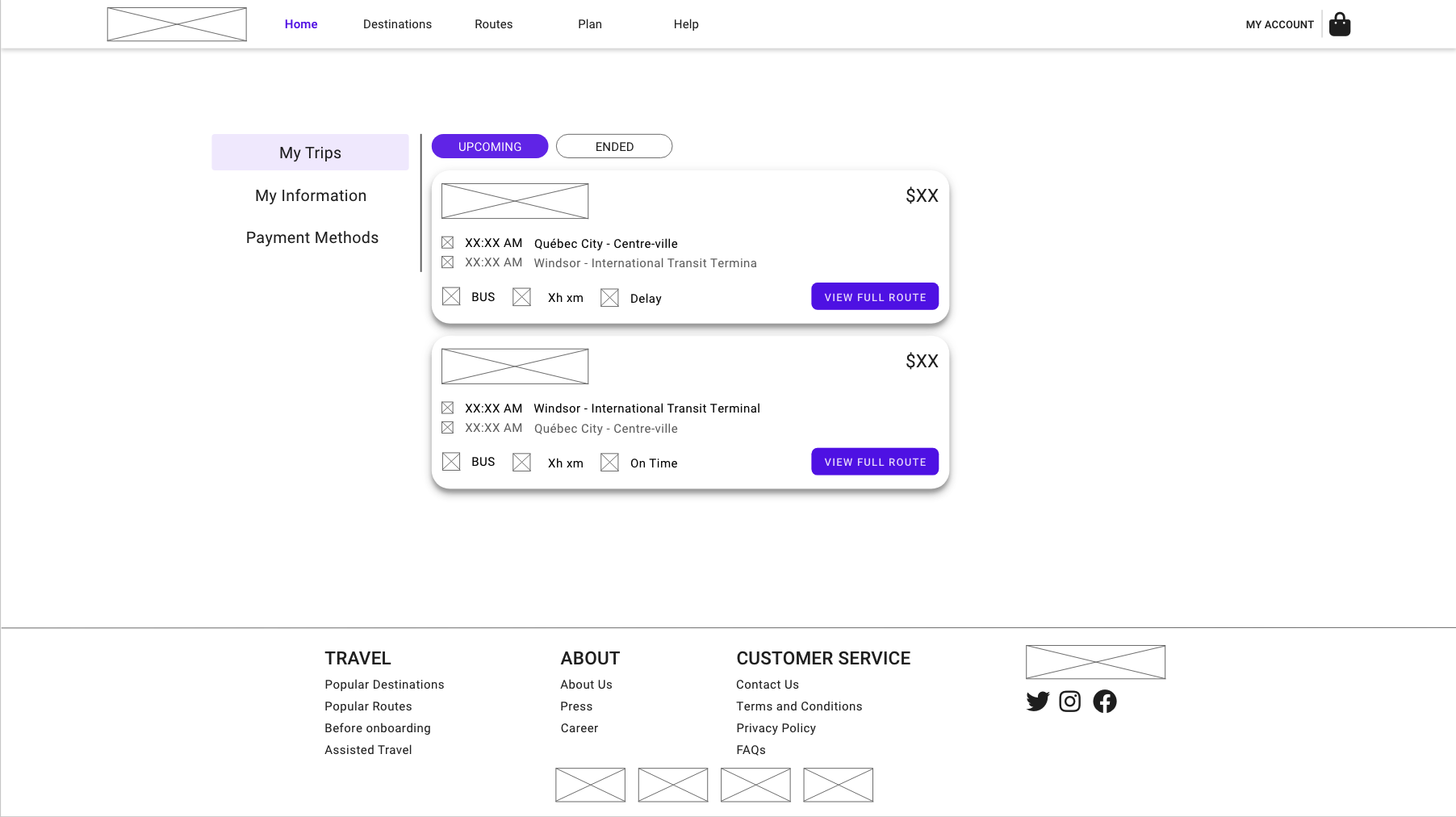 | 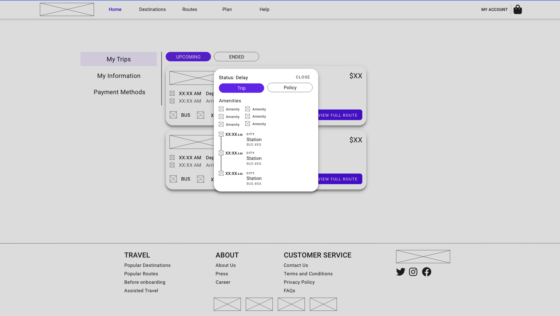 |
- One of the pages in My Account Page
- List of the trips
- Show the details when press on a single trip
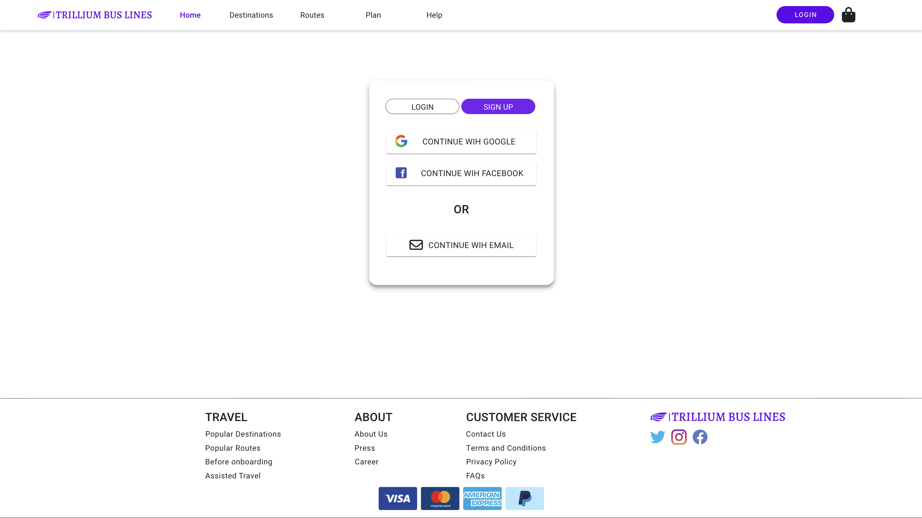
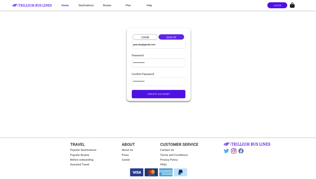
Create Account
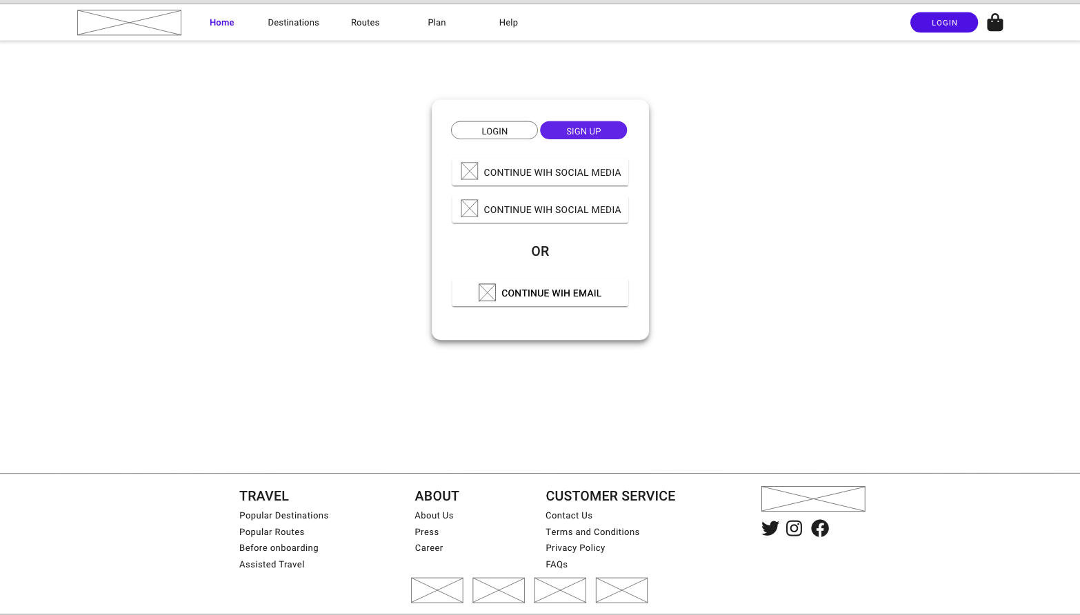
- Page to login / sign up
- SSO methods
- By Email
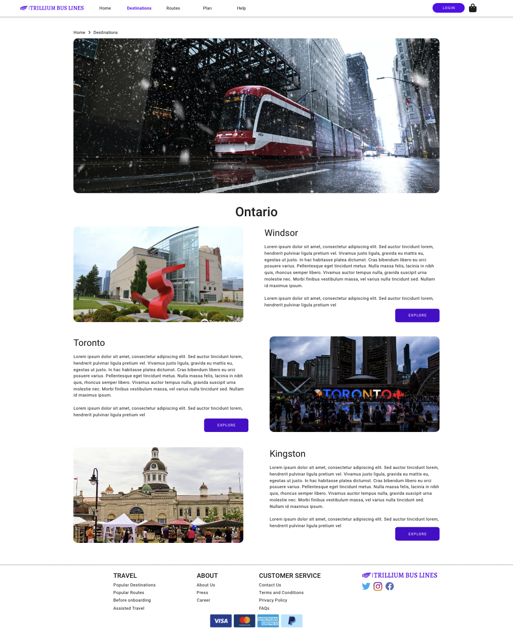
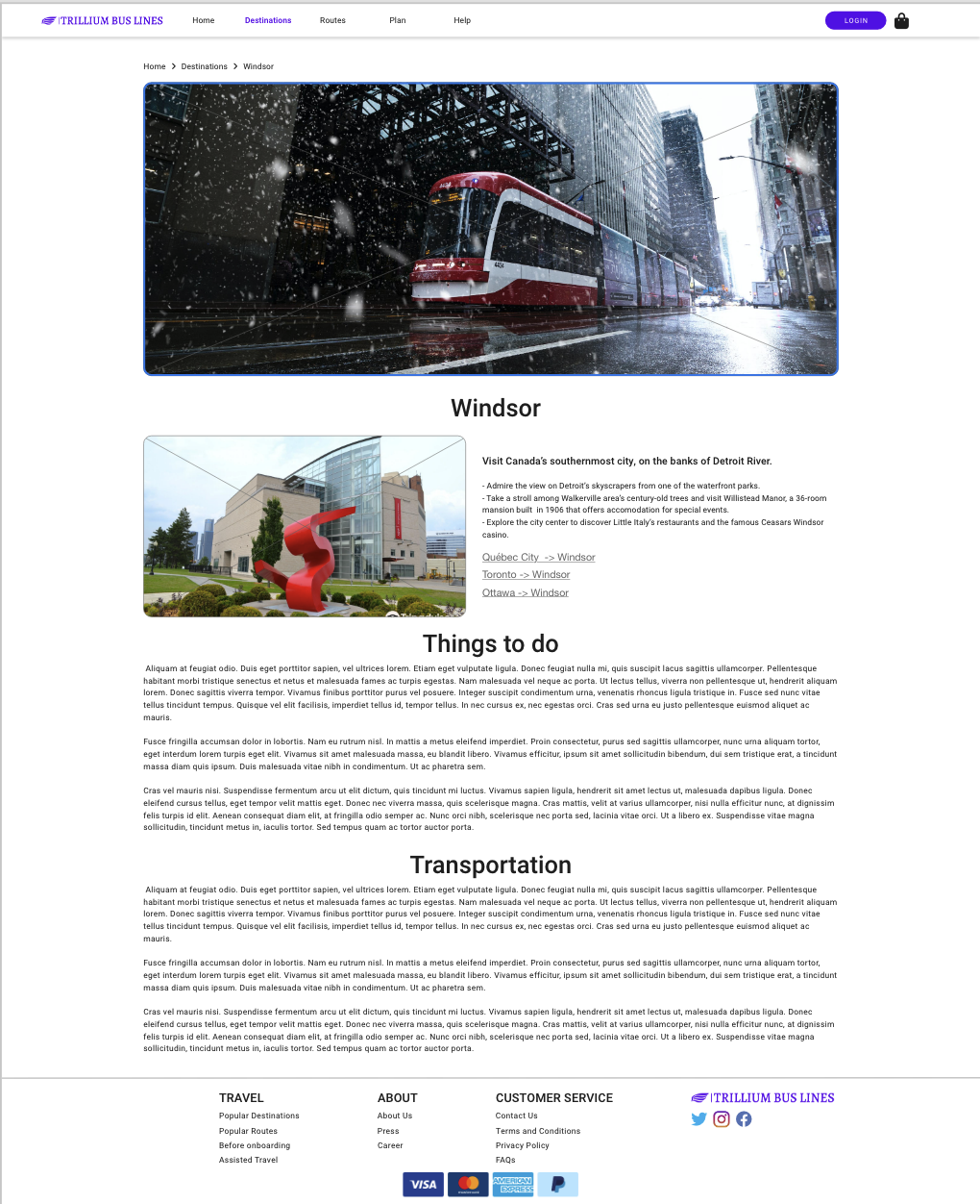
Destinations
| Destinations | Destination |
|---|---|
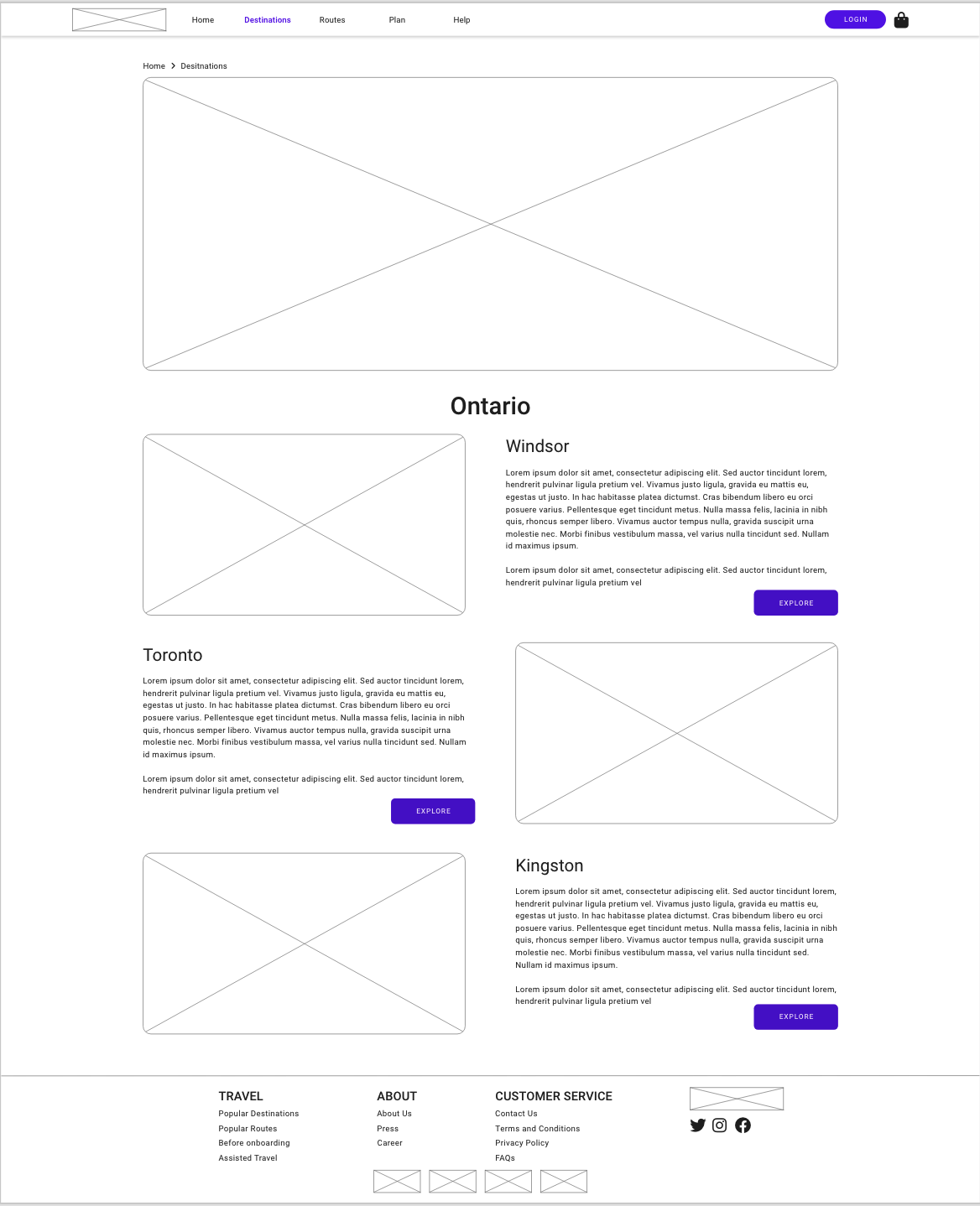 | 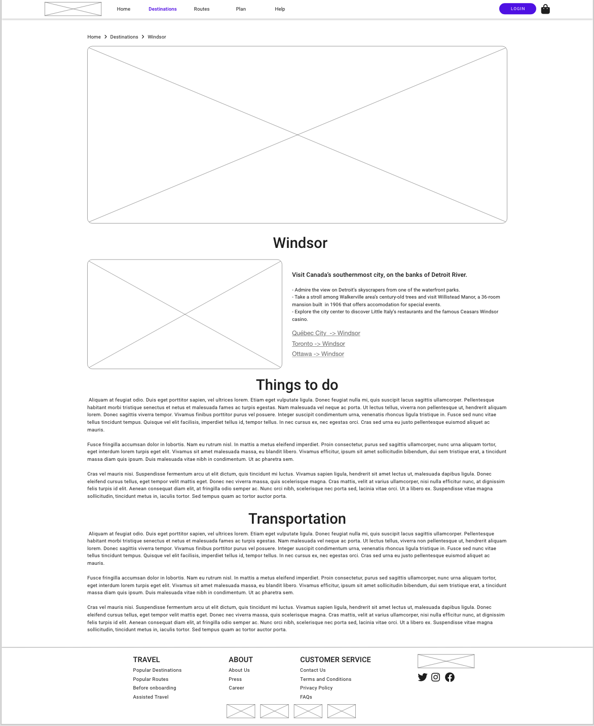 |
- Show the list of destinations that the business travel to
- Detail information about a destination (place)
- Potential to partnership for external services
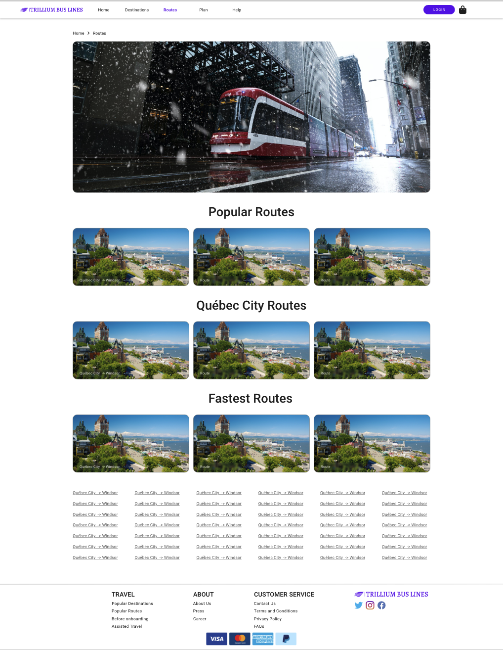
Routes
| Routes | Route |
|---|---|
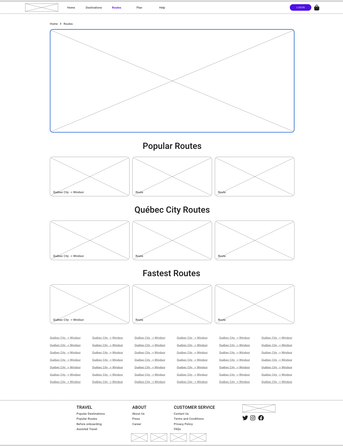 | 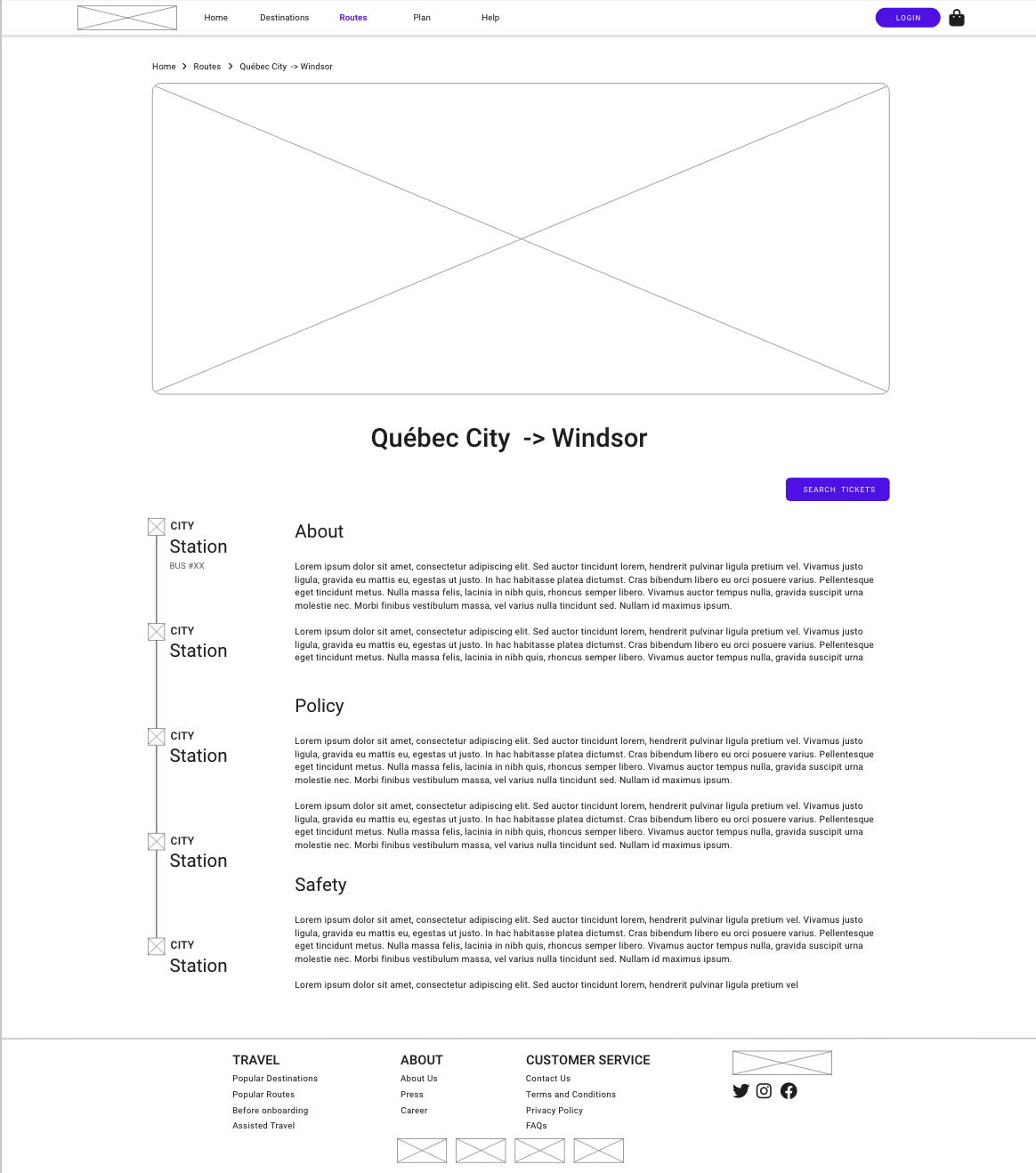 |
- Show the list of routes
- Details of the routes and what are the stop
- Allow the user to search for that particular route quickly in one click
During the low-fidelity prototype, I applied the incremental process, where I implement small pieces and keep adding element to the pages. I consistently clarify the project goals with my project manager and kept my eyes on the persona and scenario.
User Testing
The low-fidelity prototype was used for the user testing to make sure the participant can focus on the user story but not the styling. The persona and scenario created are being used in this stage.
Since there were only limited resources and time, I could only contact one of my friends who is a frequent flyer to do the user testing.
The participant was asked to do the following task.
- Find the place to look for tickets
- Select the place you want to travel from
- Select the place you want to travel to
- Pick the date you want
- Search for results
- Pick Ticket
- Go to find return ticket
- Pick return ticket
- Go to checkout
- Purchase the ticket
Some post testing questions are asked for extra information for design of the website.
Results
The participant generally like the content and the flow. There are some suggestions and error being spotted during the test.
- Destination page cannot go to the search result directly, it might be good to have the current location by default and search automatically.
- Some of items can’t perform as expected, filtering of the tickets & sorting of the tickets
- Payment step are clean and straightforward
- Create account page have quite a lot of steps
- The logo brings me to the wrong page
Solution
After the testing, I took in some of suggestions and fine-tune the prototype and proceed to the high-fidelity prototype
High-fidelity Prototype
- The High-Fidelity Prototype that includes the interactive actions will be the design solution for the project
- The High-Fidelity Prototype will refine colors, styling, and element placement
- Attention to detail in images, text, icons, and content
- Use of Lorem ipsum for large text sections to avoid inaccuracies and need for content writers
- Personal fine-tuning of missing elements from low-fidelity stage
- Relevant images to avoid placeholder appearance in prototypes
- This solution focus on searching the ticket and purchase for logged in user
Home Page
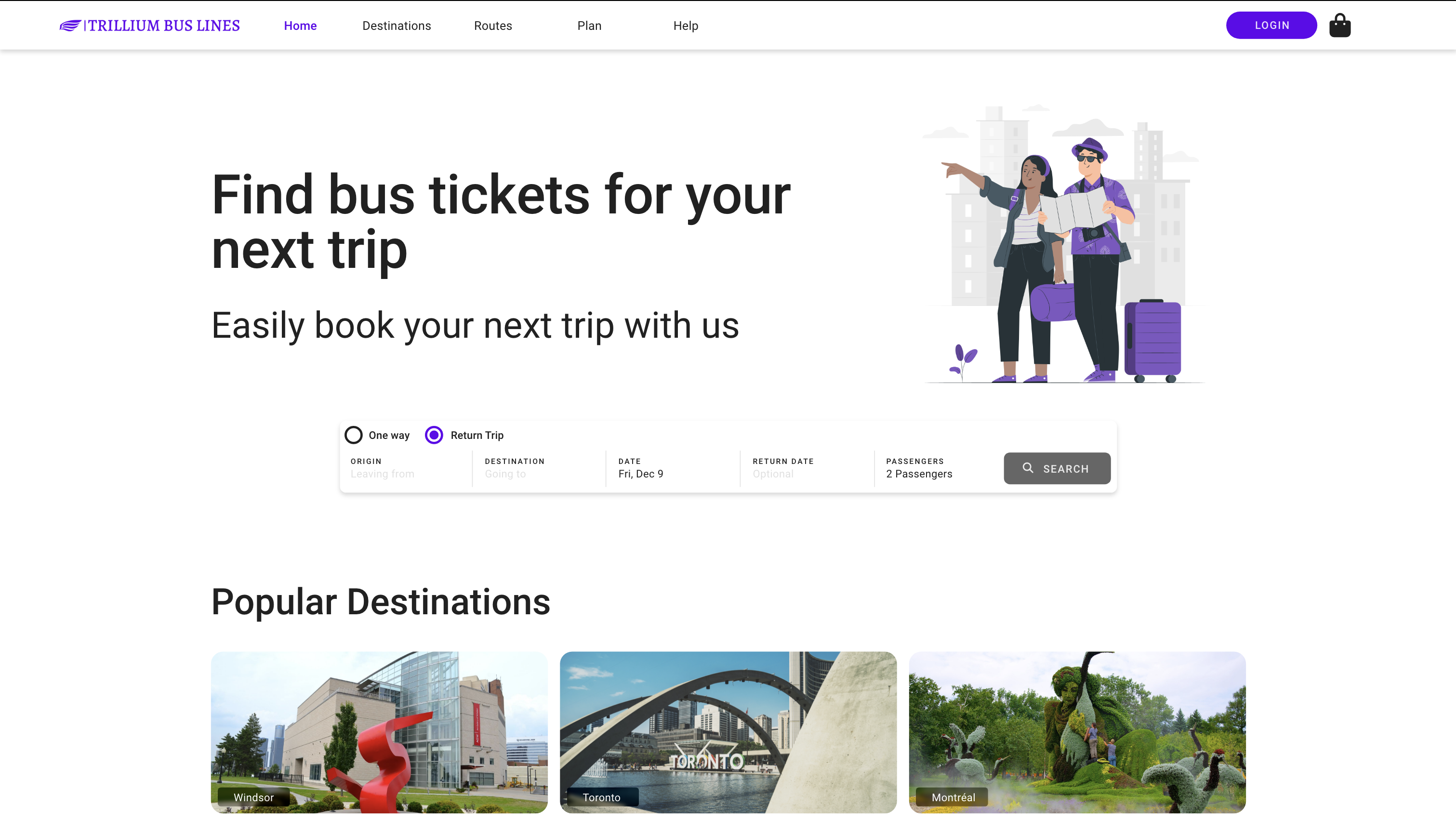
- Headline and Tagline to show brand value
- Search bar first noticeable item on home page
- Select Single / Return trip
| Origin Picker | Destination Picker |
|---|---|
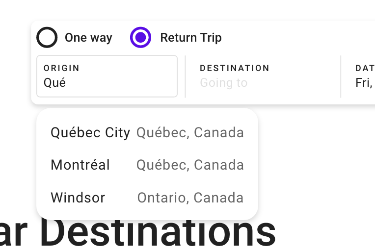 | 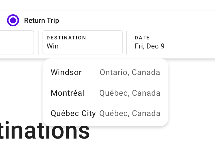 |
- Suggest places
- Pick the locations to travel from and to
- Auto completion of places name, it reduces typo and practice error prevention4
- The list is limited to show less than 10 items5
| Date Picker | Passenger Picker |
|---|---|
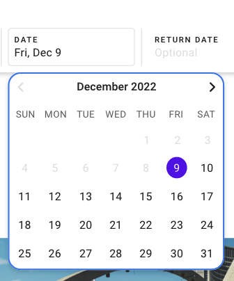 | 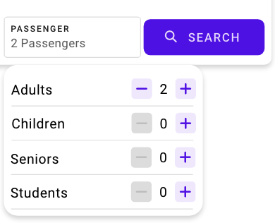 |
- User can pick the depart/return date for the trip
- Pick date on calendar
Shopping Bag
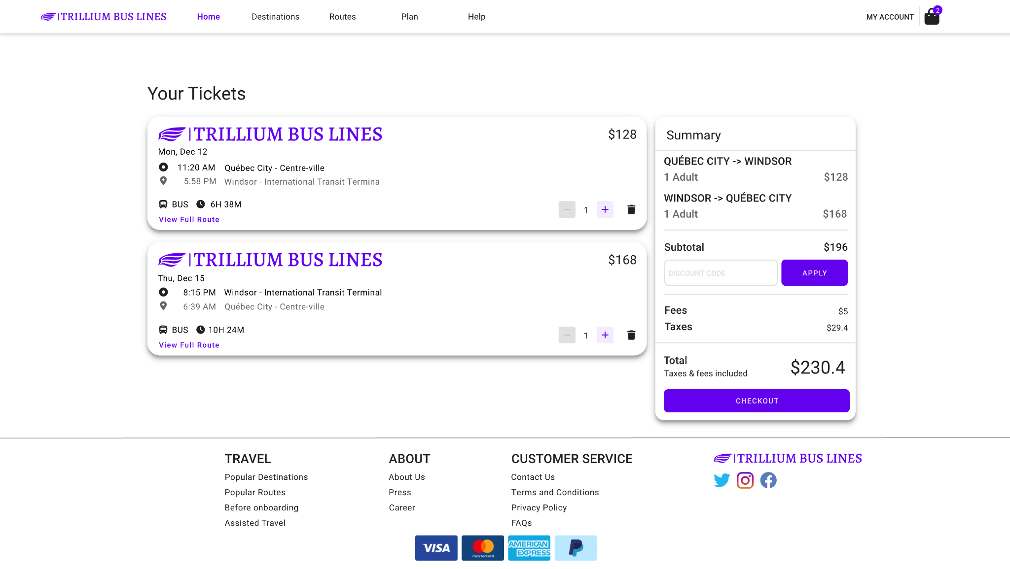
- List of trip
- Show details
Checkout Pages
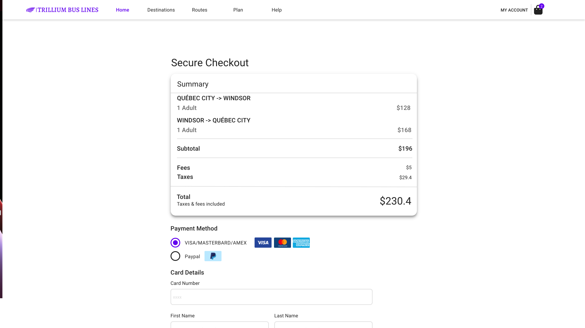
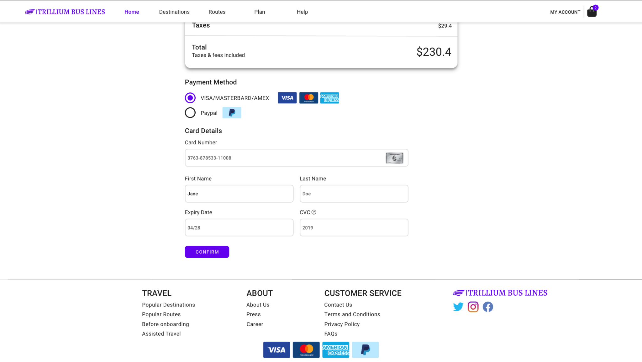
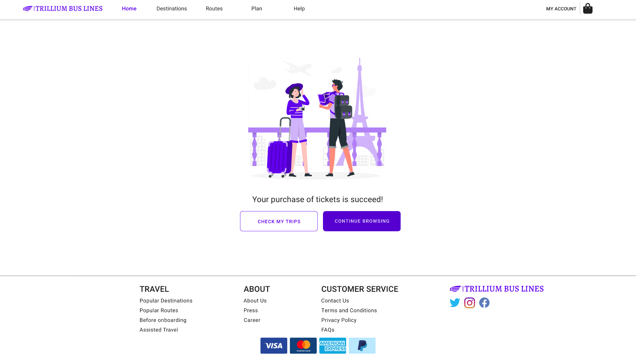
- Error status are adding to the input field
- Actual images for card and payment methods are added
- A relevant image for the success page
My trips
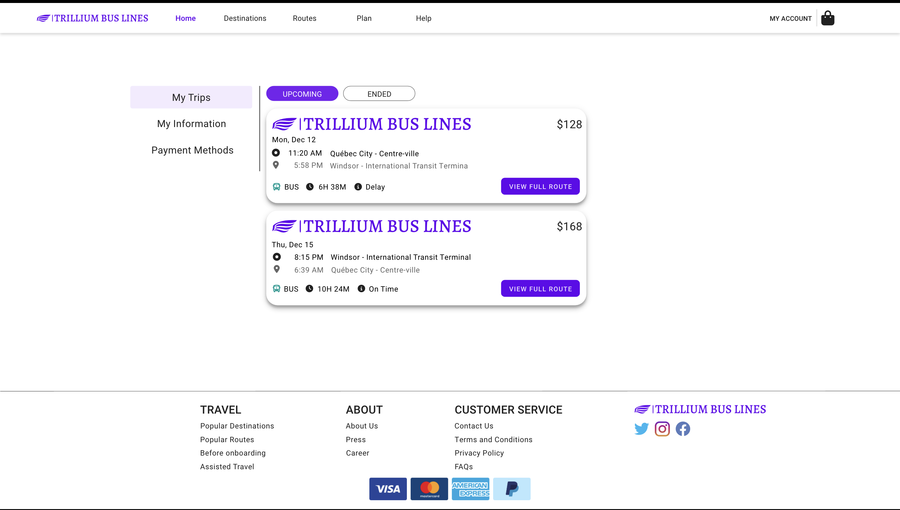
- Show the actual details of the trips
- Add icons to indicate the information better
- Tab control
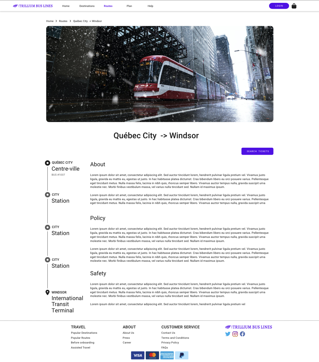
Trip Details
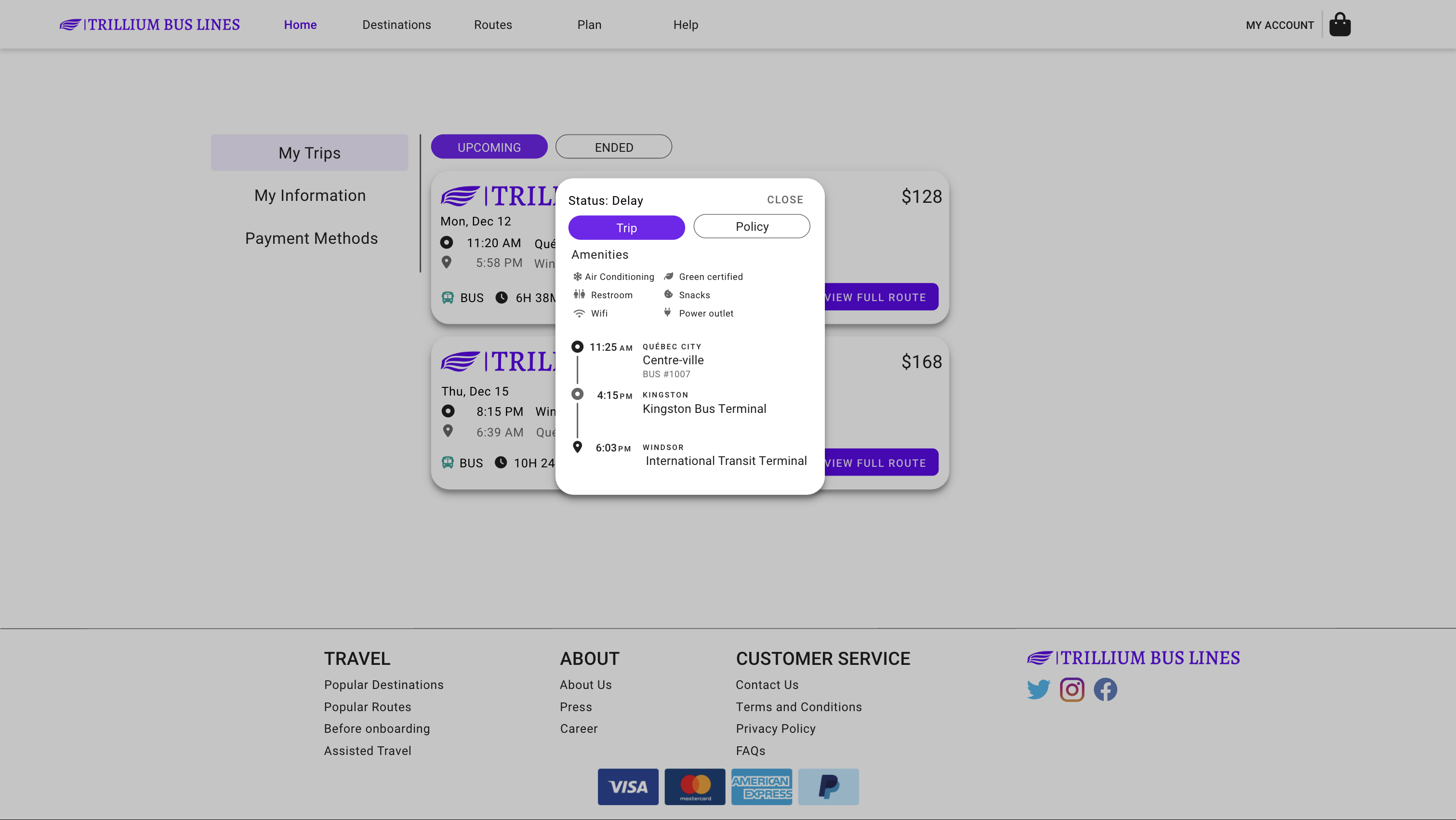
- Show the list of amenities
- Detailed route information and stops
- Status on the top
Trip Policy
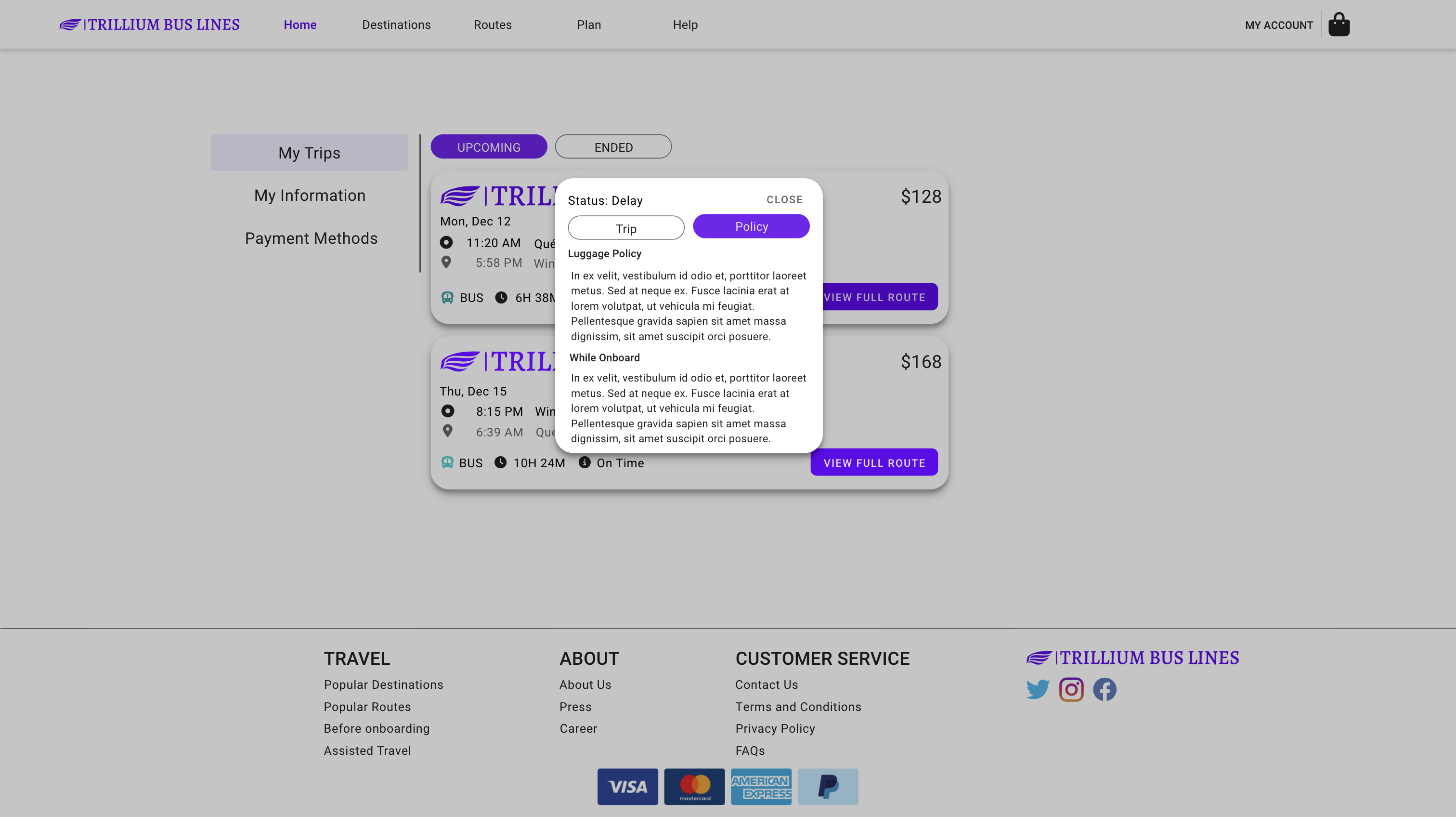
- Policy shows all the details of what the user should know
Create Account
- Add in coloured icons
- Add relevant image
- Add error status reporter on input field
Destinations
| Destinations | Destination |
|---|---|
 |  |
Routes
| Routes | Route |
|---|---|
 |  |
Conclusion
It was a school project for a fictional company. I did a whole design process from research, analysis, design and evaluation. However, since there will be no one to hand it over to for the implementation, it was not implemented as a website. The final deliverable was presented in a presentation deck to the project manager.
I hope this case study would give you some insights into my design process for the project.
Reflection
Research
I did competitor analysis and simple user testing. Most of the research, I did were secondary research, which gave me only limited information about the product and market. However, given the time frame and plan, I tried to experience most of the websites so I can reduce as many biases as possible. The sitemaps took quite a long time to figure out different approaches and information architecture.
If I were given more time, I would do more research such as:
- Card Sorting: To understand the user’s expectations on how they group things.
- Interview: To understand user goals and expectations.
- Focus groups: To allow different users to share their opinions with each others and get some new insights during the sections
Process of design
I did enjoy the process that I applied which is a bottom-up approach, by building small elements and connecting them into pages. It helps me to finish milestones at a graceful pace. However, I focused too much on the design details of the low-fidelity prototype. It distracted me from designing a better user flow and turns out there were some errors. I would probably spend less time on the low-fidelity prototype on elements and styles, but instead of spending time on the user flow and story.
The personas and scenario helped a lot in my design process so that I can get back on track and refers to the user goals. There is a time when I spent too much time on the create account, but it was not the main user goal, I referred back to the scenario and re-prioritised my tasks and schedule to meet the milestones and timeline.
Improvement for the design
- Some of the modals are quite small, since it was a desktop-first website, I could make the modals a bit larger to make use of more space
- Destination page could add a button to quickly search for the tickets from the user location
- For the logo in the tickets, it might be too large, it could be reduced to just the logo without name
- While I considered using the centralized design to keep the viewing area to the middle, it might be too small and too many white spaces on some pages.
- Consider more the shopping bag summary, and how to show the relevant details of the selected trips in a clear way.
- On the shopping bag page, something like “Places you may also like” could be added to encourage the user to explore other similar places.
Link to low fi prototype
Link to high fi prototype
Resources & References
Footnotes
-
Frost, Brad. “Atomic Design.” Brad Frost, 20 Oct. 2021, https://bradfrost.com/blog/post/atomic-web-design/ ↩
-
Google. “Foundations - Material Design 3.” Material Design, https://m3.material.io/foundations. ↩
-
Hatzis, George. “Checklist Design.” A Collection of the Best Design Practices., http://checklist.design/. ↩
-
Nielsen, Jakob. “10 Usability Heuristics for User Interface Design.” Nielsen Norman Group, 15 Nov. 2020, https://www.nngroup.com/articles/ten-usability-heuristics/. ↩
-
Tandra, Pranava. “Best Practices: Designing Autosuggest Experiences.” UX Magazine, 16 Apr. 2021, https://uxmag.com/articles/best-practices-designing-autosuggest-experiences. ↩