Background
The City of Kingston commissioned a project to redesign their internal website, KingNet, with the aim of improving internal communication and employees’ success. The existing website was primarily used for submitting service tickets and accessing other services, but the City of Kingston sought to create a more centralized hub, making resources and services easy to locate for their employees. The ultimate goal was to increase employee engagement and have them access KingNet not out of necessity, but as a valuable communication tool.
The project involved a range of key tasks, including task and date organisation, meeting note-taking and minute writing, literature review, survey analysis (conducted with a partner), note-taking for interviews and feedback sessions, designing support-related pages, creating and modifying page versions (completed in collaboration with a team member), and testing website usability. The project was desktop-based, and tools used included Figma, surveys, interviews, and feedback sessions.
The project team comprised researchers, UI designers, designers from the City of Kingston, and stakeholders from the organization. The new KingNet design was successful in creating a centralized hub for resources and services, making it simpler for employees to locate the necessary information. As a result, employee engagement increased, and internal communication within the City of Kingston improved significantly.
Project Goals
The main purpose of this project is to redesign the landing page and support pages focusing on the frontline workers to create a better user experience.
There are some business goals that City of Kingston would like to achieve in the new KingNet design
- Main channel of communication
- Increase engagement
- Centralized access
- Main resource for information
- News & Communications portal
- Corporate Job Board & Org chart
- Efficient and customizable UI
- Analytics and access to data
- Employee surveys
Research
Goals
In the research phase, I tried to understand the common features and target customers for the business. This project focuses on secondary research of a competitor scan. I found different potential competitors of the transport service providers. In this stage, the goal will be to find some common practices, features and layouts. I checked out each competitor based on a list of criteria, and seek what opportunities we can have for the business.
1. Competitive Research
Our first step was to conduct a comprehensive competitive analysis to gain insights into competitor design patterns, structures, and best practices.
It helps us to understand the competition, and how KingNet can differentiate themselves. This information can be used to develop better products or services and create more effective marketing strategies.
Findings
- Two panel design is being used
- Some customization for the layout
- Divide home page real estate
- Personal / Department functions
- Indicate the current page
- Customized region
- Knowledge area
- News area
- Spotlight area
- Firm-wide calendar
2. Literature Review
We reviewed existing literature on Intranet website design to obtain knowledge about the latest design trends, usability standards, and user experience.
Findings
- A intranet should increase engagments
- Follow design patterns like 80/20 rules, 60/30/10 colour rules and IA principles
- Navigation
- Avoid Deep, Unclear Global Navigation
- Allow Global Search
- Different Link Labels
- Indicate the current page
3. Survey
To better understand user expectations and feature usage, we conducted a survey to collect feedback on the current KingNet website. Questions like what is the user goal, favourite features have been asked. The survey results were analysed to show a set of key insights to the client and used as a reference for wireframe. There were 15 participants who are working as frontline workers.
The survey provides valuable insights into consumer preferences, behaviors, and opinions. This information can be used to improve products or services, refine marketing strategies, and identify new business opportunities.
Findings:
- KingNet is not a part of the main communication channels for participants.
- Favorite things are not actually part of the intranet but external platforms.
- People prefer not to use KingNet if it’s not completely necessary.
- Quick links are useful and preferred.
- Nobody uses top navigation bar.
- Not everyone can access KingNet.
4. Interviews
We also conducted a series of interviews with key stakeholders and users to gather information about their objectives for the redesign and identify any potential obstacles. We found out that the frontline worker and stakeholders have a pretty different point of view on the new KingNet. However, we do see that getting support is a huge thing on KingNet, so I tried to create a page for support to reduce user headaches. 3 Participants, 2 Stakeholders and 1 frontline worker.
Findings
Landing Page
- Space not being utilized efficiently
- Quick links are useful
- Outdated styles make users feel uncomfortable using KingNet
- Users need quick access to support service
- Polish News / Announcements section
Support Page
- All participants use “Service Desk” mainly for their support
- Forms are not easy to find for some support services
- Alternate methods (offline) are more efficient
- Facilities’ support pages are not being used frequently
- Cannot find information on FAQs pages
- Users do not know where to look for or ask for support
- Hard to find the responsible person
1st Wireframe
Goal
This stage focused on the layout of the pages, extra pages and content to be added based on the survey
Wireframe
2nd Wireframe / 3rd Wireframe
Goal
This stage focused on the location of the elements and the display of them. This stage also ask for feedback on the initial wireframe and get user expectations on the new designs
Design
Feedback Session
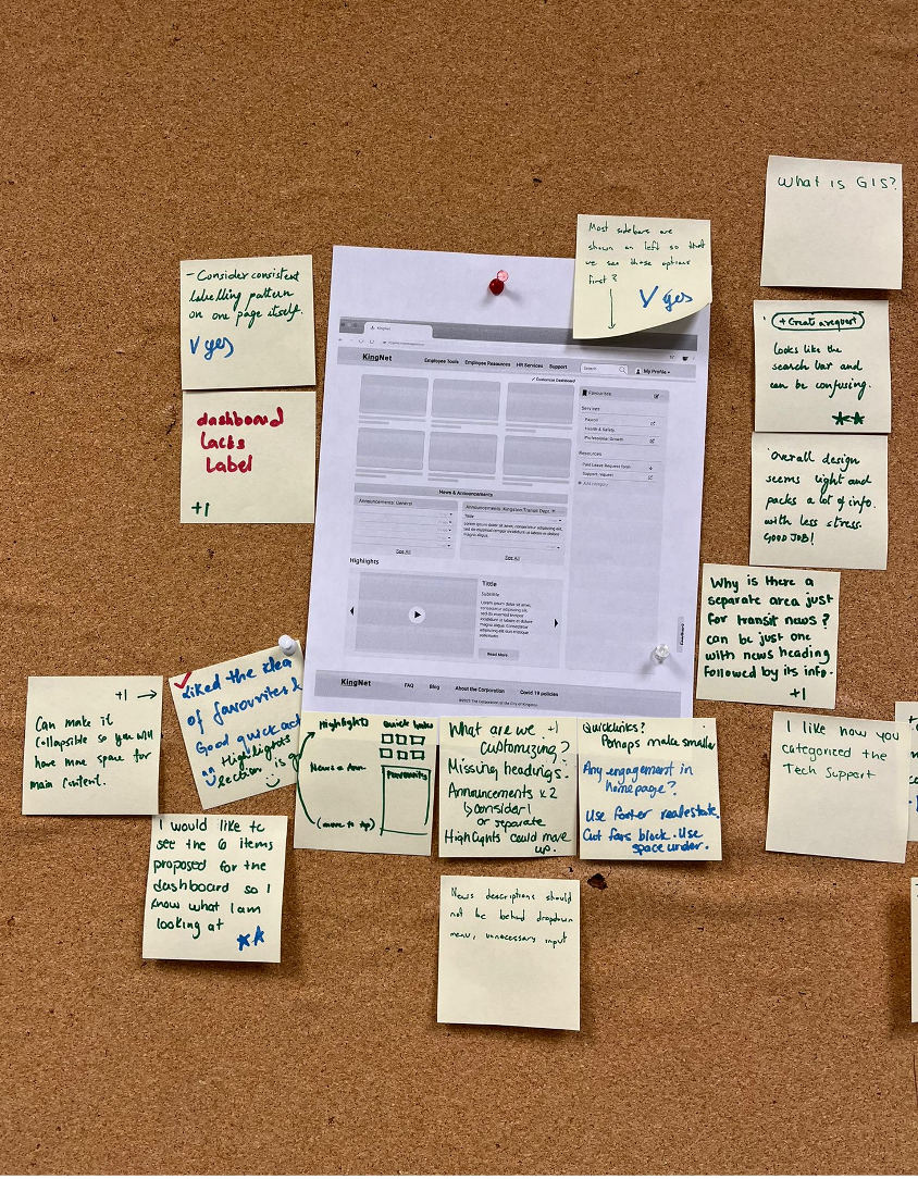
We conducted 2 feedback sessions with 1 hour each with 2 stakeholders and 2 frontline workers.
It provides us with valuable feedback from users, allowing us to improve the design, address user concerns, and increase user satisfaction.
A/B Testing
Two designs were conducted after the internal feedback sessions. We use them for the later feedback section to our clients and get their feedback.
A/B testing allows us to test different versions of our assets and determine which version is more effective in achieving their goals. This helps us optimize our design and improve their overall performance. A/B testing can be used for a wide range of marketing assets, including website pages, landing pages, email campaigns, social media ads, and more. It is a powerful tool for improving marketing ROI and optimizing marketing spend.
Option A
Option B
Findings
Landing Page
- Straightforward and clean is needed
- Layout is preferred when it shows optimized use of space
- Org chart is a must
- New Hires/Jobs will be good to have
Support Page
- Search area is prominent and useful
- Filter is not necessary since technical support and facilities support are often handled separately
- “Create a request” is a good feature, need to be more prominent
Your Rquests Page
- Clean enough
Article Page
- Good to have those article information
- Will be good to add a related articles section
- Medias are good
- Sub section need to be collapsible
Final design on this stage
Final Prototype
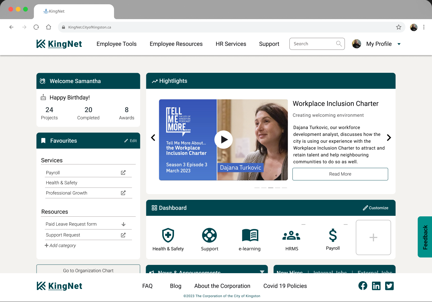
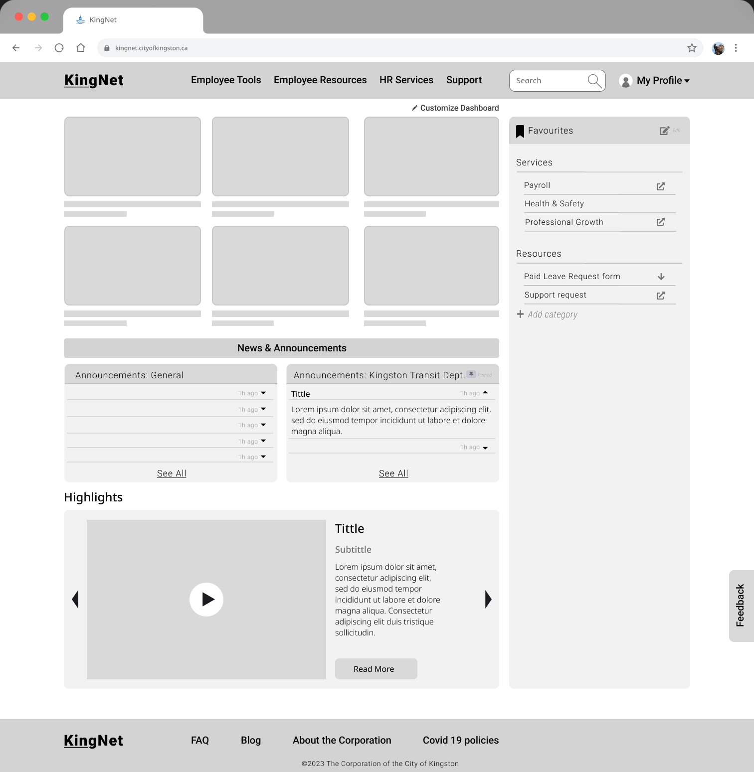
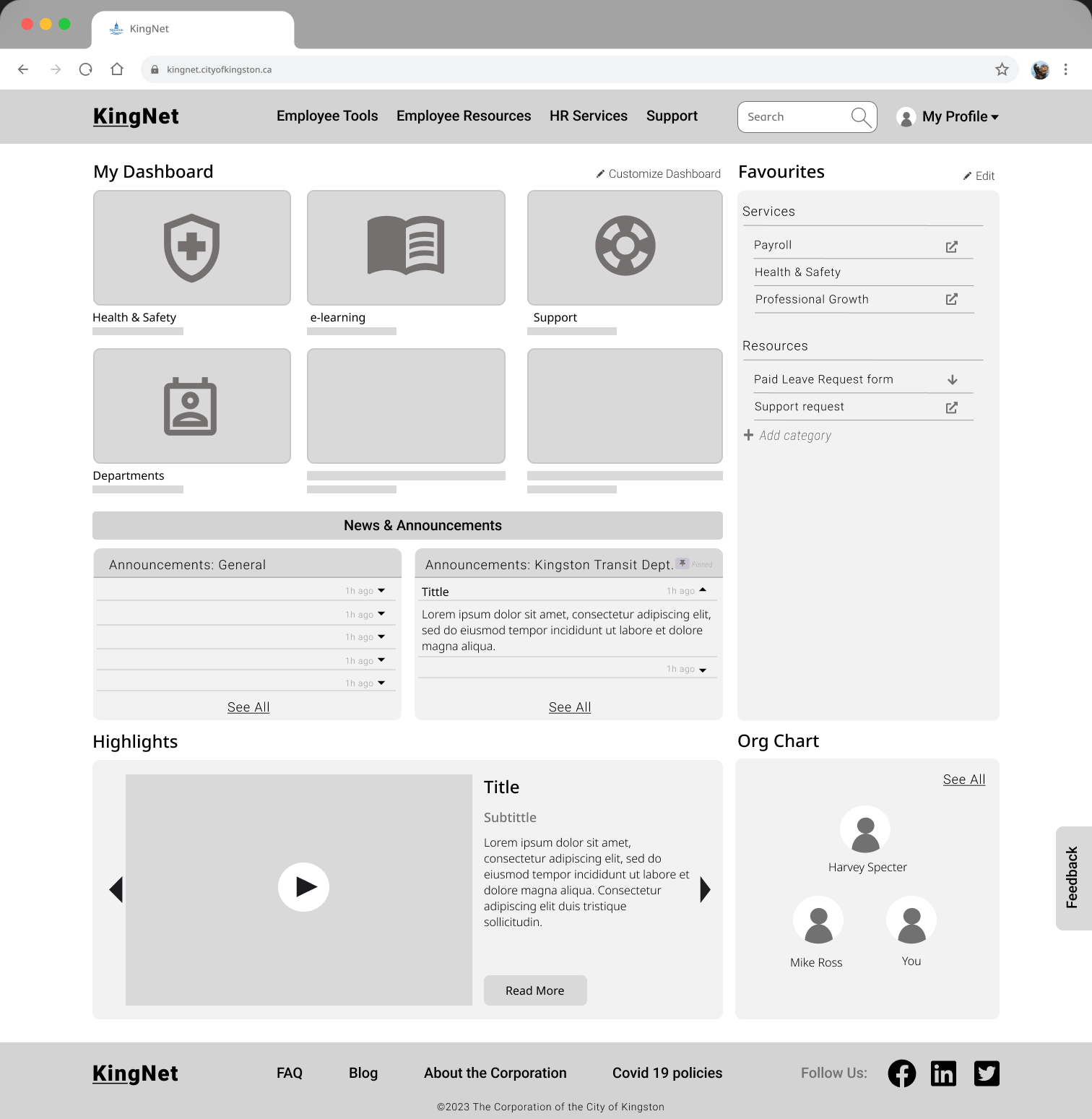
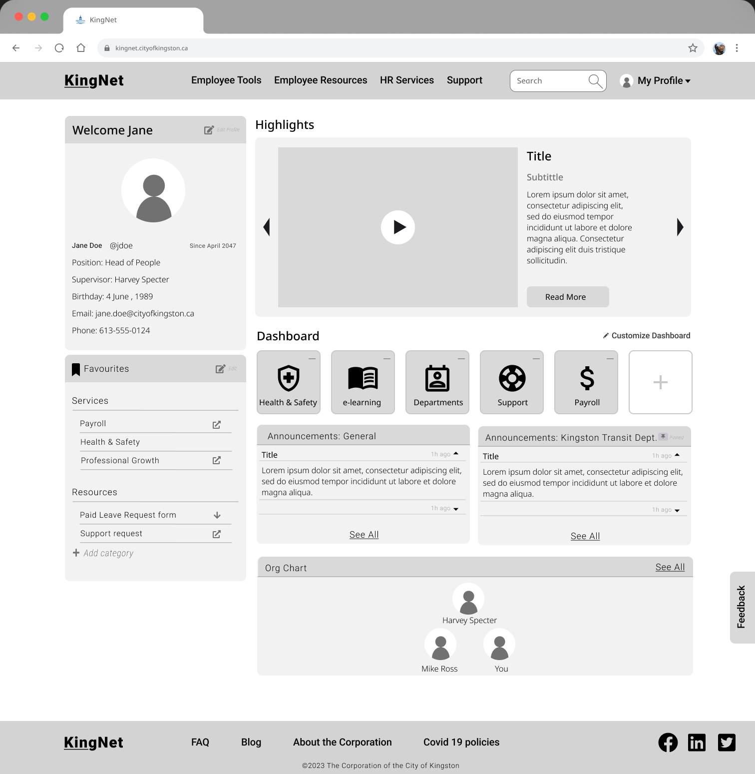
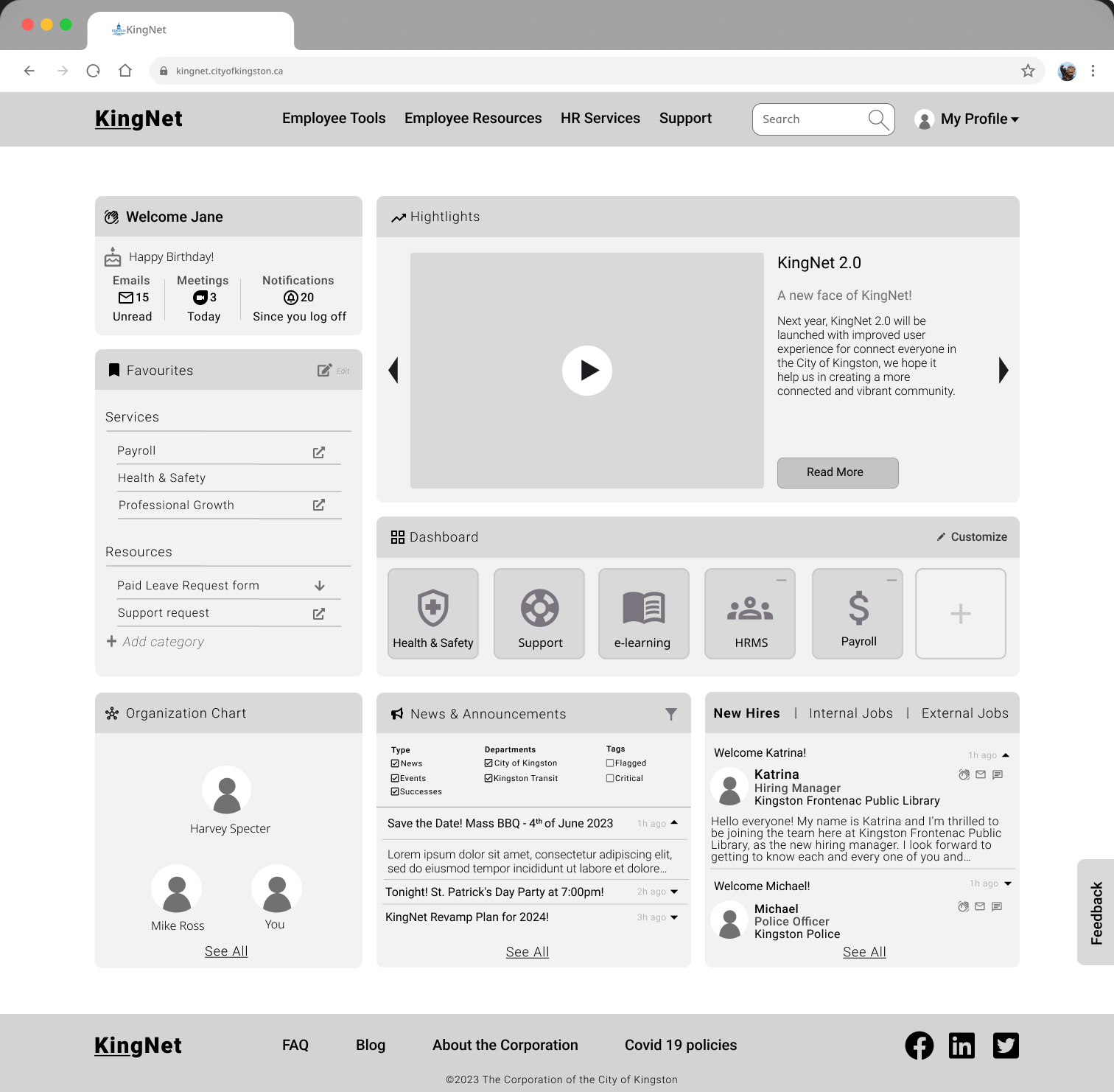
Landing Page
A landing page is the initial webpage that a user sees when they visit a website. In the context of an employee portal, a landing page is designed to provide quick and easy access to information that employees need on a regular basis. The landing page includes various features such as a welcome widget, favourites, links to the organization chart, polling, highlights, dashboard, news & announcements, and new hires & jobs.
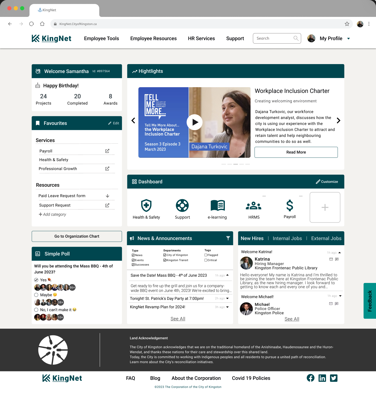
Welcome Widget
The welcome widget is a personalized greeting to the employee, which includes their name, employee ID, and personal achievements. This feature helps to create a sense of belongingness and welcome to the employee. Favourites allow employees to add links to their most frequently used resources and categorize them for easy access.
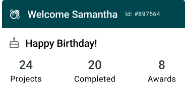
Favourites
This feature allows employees to add links based on their specific needs and create their own category names.
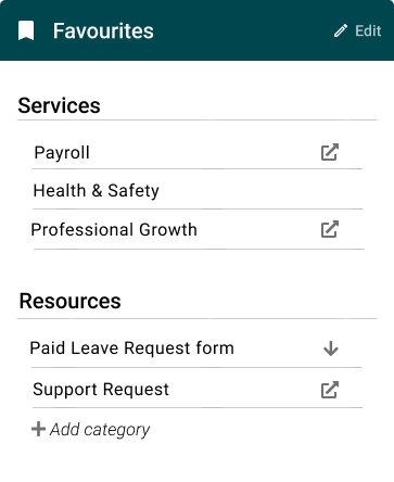
Link to Organisation chart

The link to the organization chart provides employees with quick access to the contact information for their colleagues and team members.
Alternative:
Polling
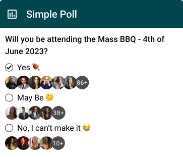
Polling is a feature that allows employees to quickly assess engagement and gather feedback from their peers. For instance, let’s say you’re planning a team-building activity and want to know if your employees would like to attend a party or not. You could create a single-question poll and ask your team if they would like to join a party or not. The poll creator can customize the choices and the participants can select their choice with just one click.
Highlights
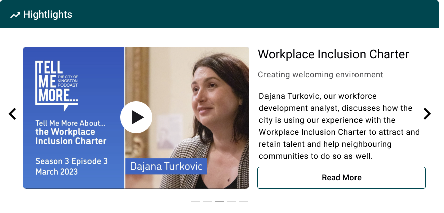
The highlights section is designed to reduce the chance of important updates getting buried in emails. It provides a carousel where you can add various types of content, such as images, videos, or links to important announcements. The content can be used to showcase achievements, recognize employees, or share important updates such as upcoming events, deadlines, or company news. This section is displayed prominently on top of the landing page, increasing the exposure of the content to the employees and keeping them informed and engaged. The content is also customizable, allowing employees to view the information they find most relevant and interesting.
Dashboard
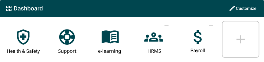
This feature allows employees to have up to six items, with three being static items setup by City of Kingston based on importance, and three being customizable items specific to their needs.
News & Announcements
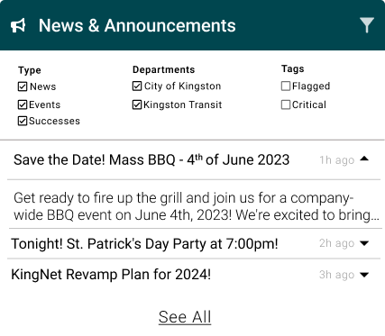
News & announcements provide employees with the latest updates and information about the organization. It allows employees to filter news and announcement by type, department, and tags, and see the date of the article, and the widget is expandable to show more information.
New Hires & Jobs
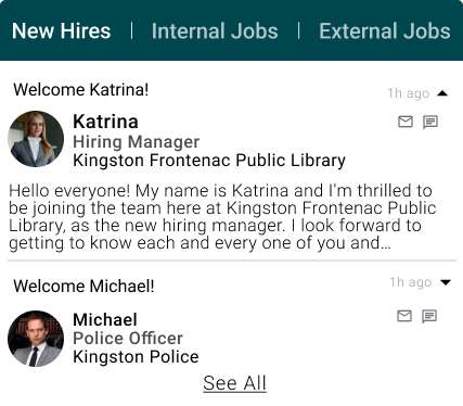
This feature is designed with tabs to make it easy to navigate, and employees can see new hires’ images, name, self-introduction, and contact methods. This helps promote a welcoming and inclusive culture in the organization.
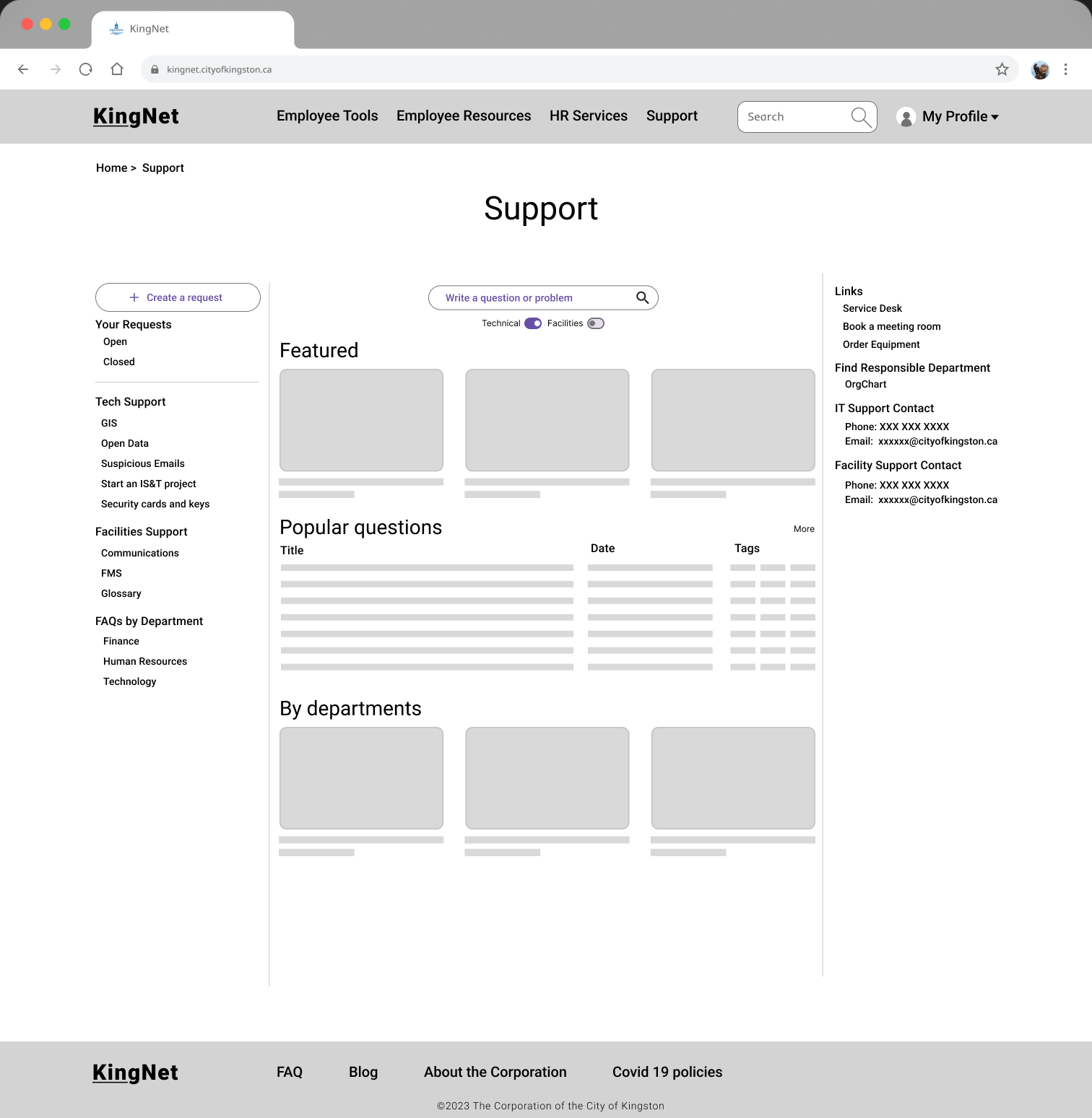
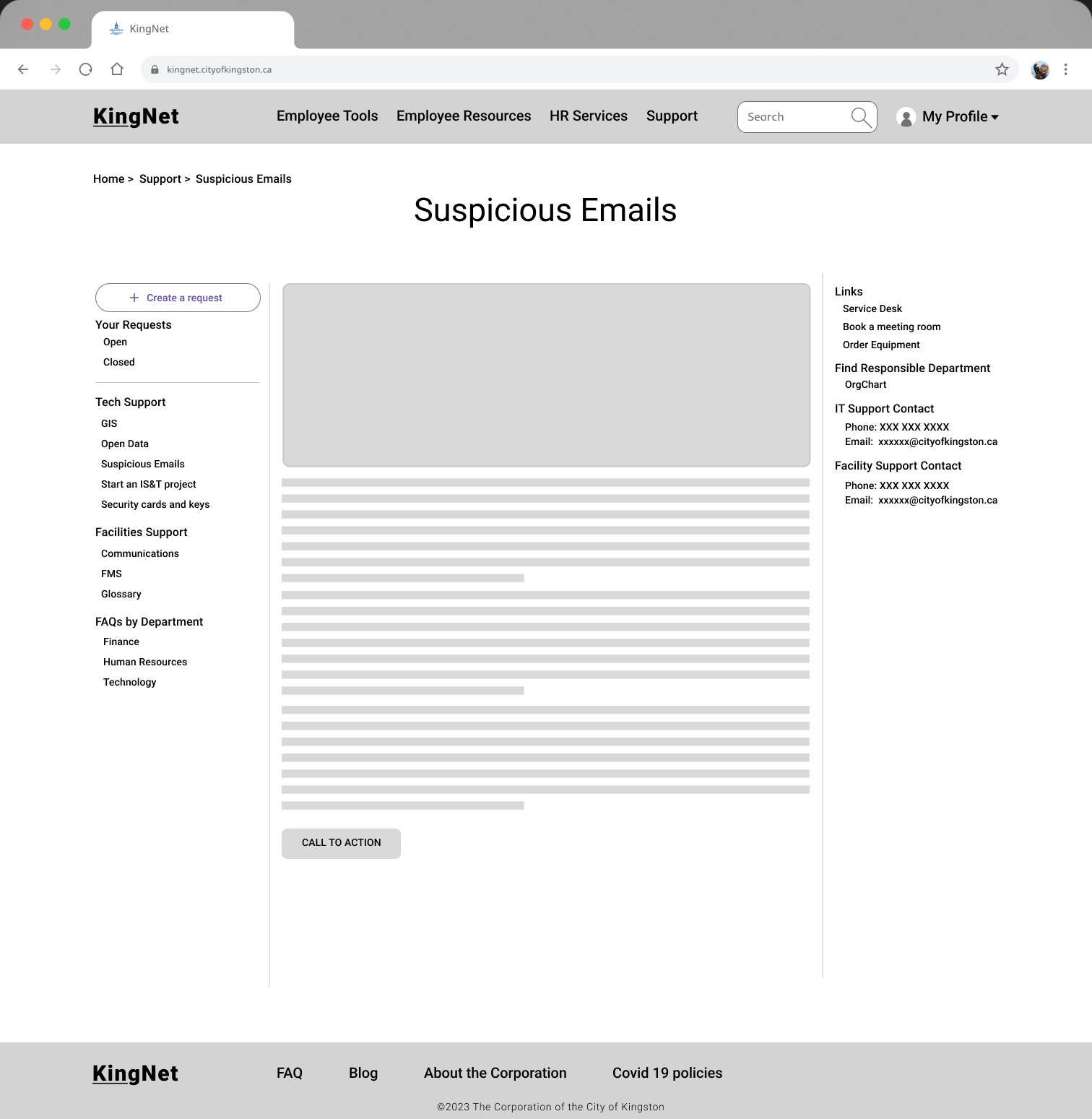
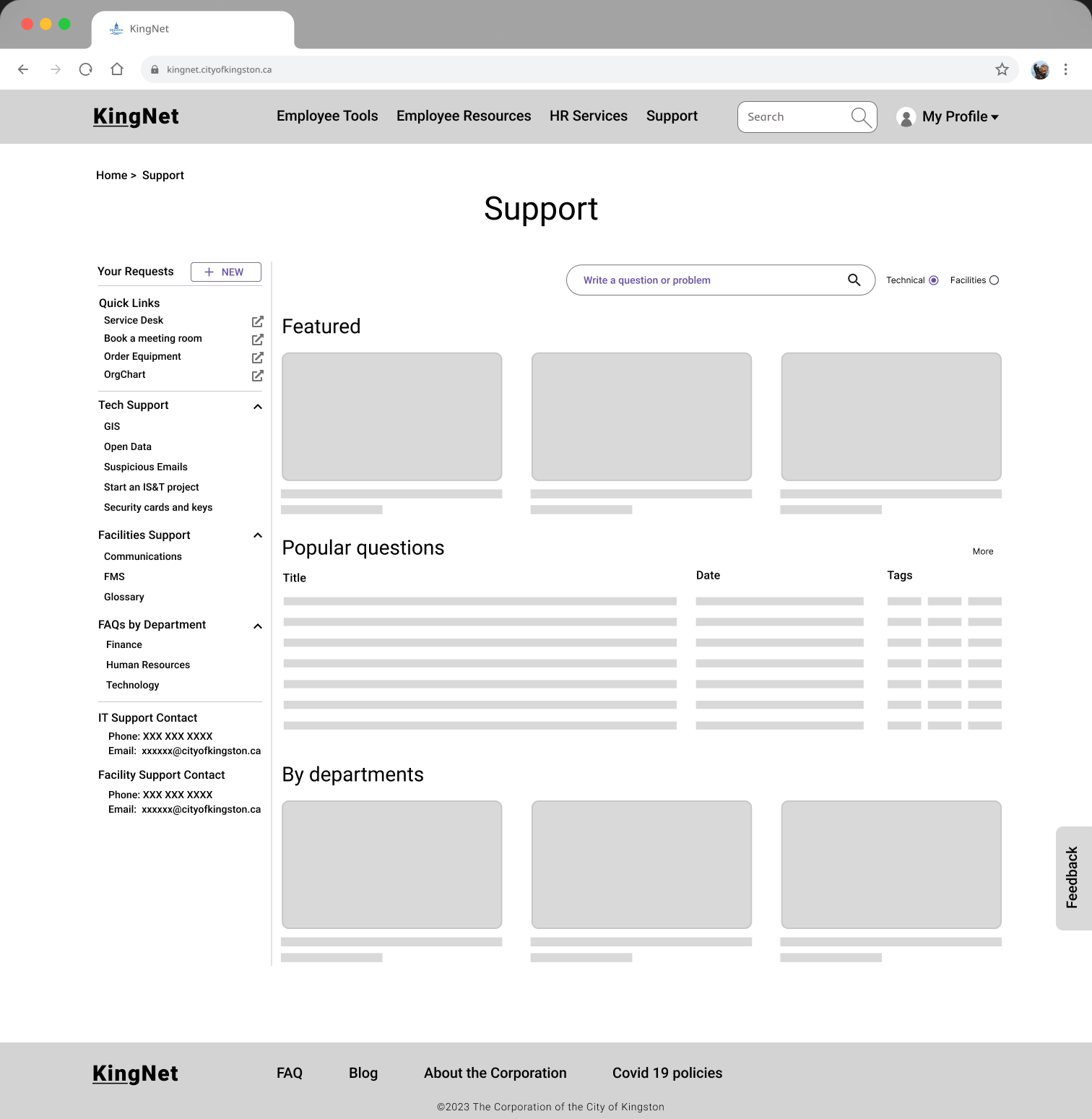
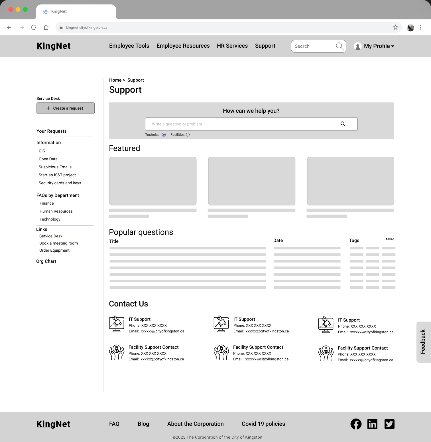
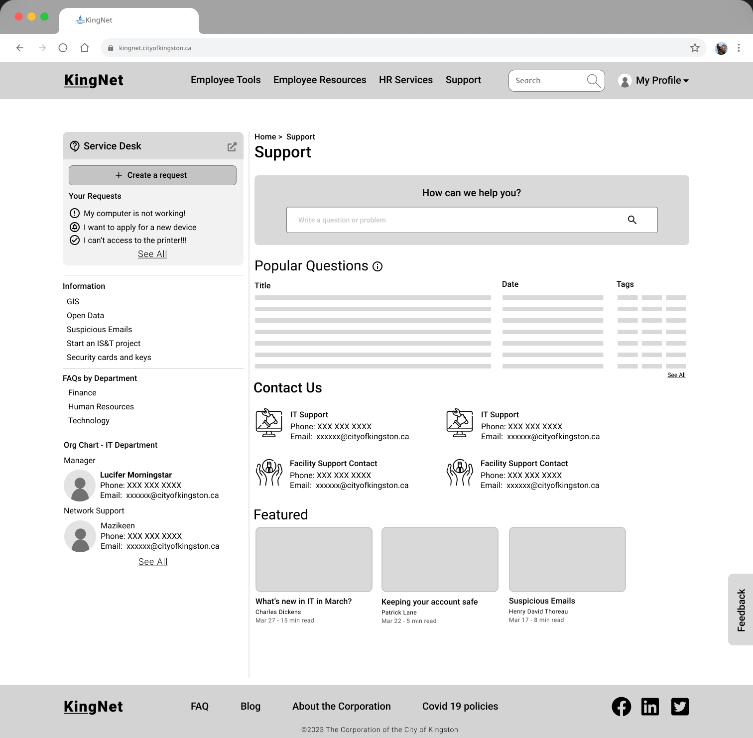
Support Page
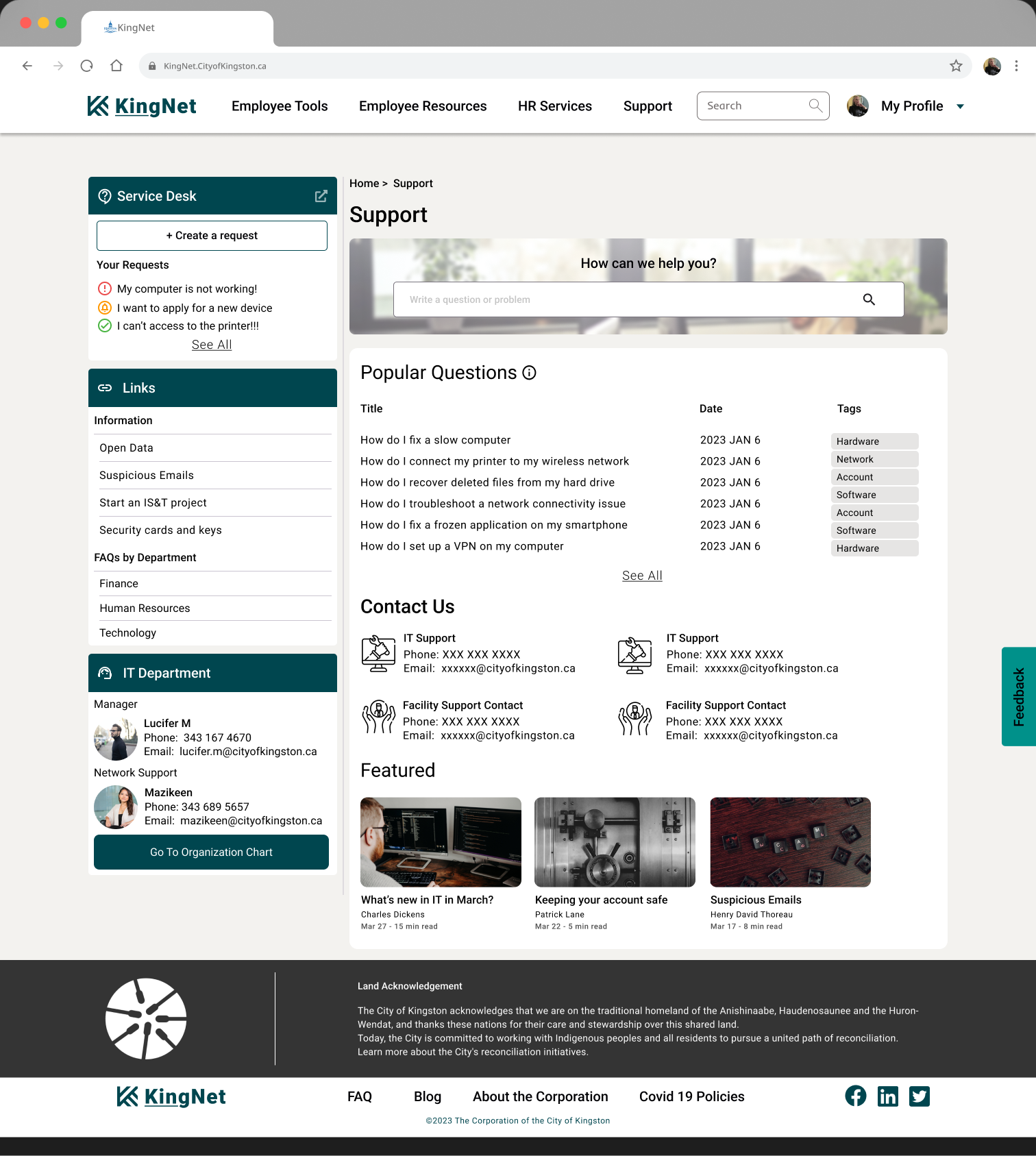
Service Desk
The service desk widget provides employees with a quick and easy way to access information related to support requests. It displays recent requests to help users reduce the number of pages they might have to go through and a button to directly create a new service request. This feature allows users to track their request in detail.
Links
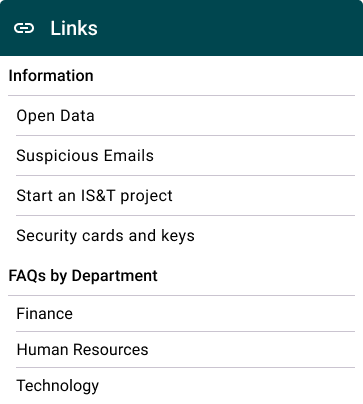
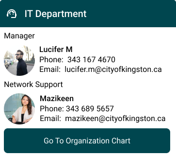
Department
The main page for support has been created keeping in mind the users needs of easily being able to access information. Providing a widget to service desk that displays recent requests to help users reduce the number of pages they might have to go through and a button to directly create a new service request. Your requests will help users to go track their request in detail.
Search Area This is shown prominently on the page that user can go search for a solution instantly
Featured Article
It was placed at the bottom given that the user is desperate to find support and not interested in reading anything before solving their problems
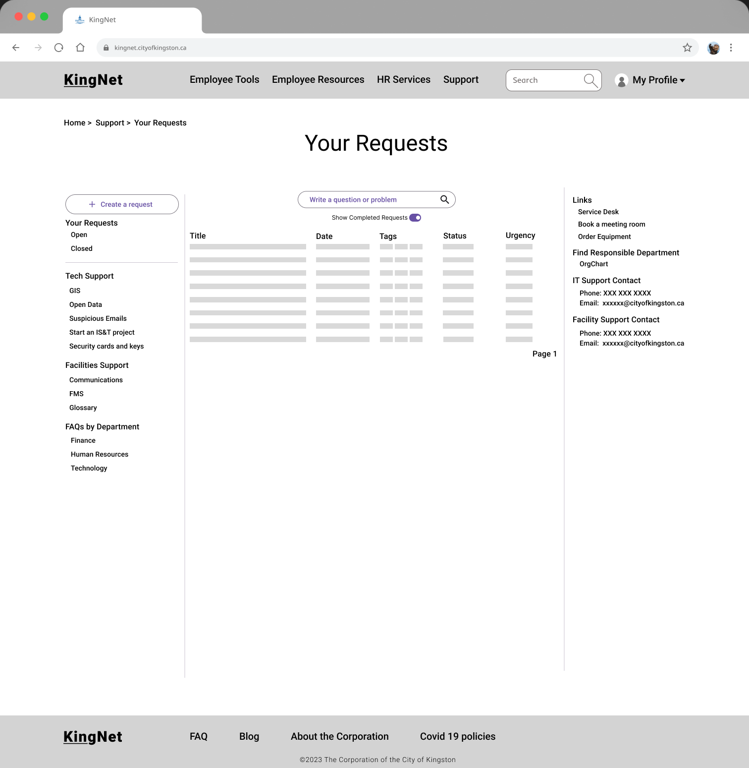
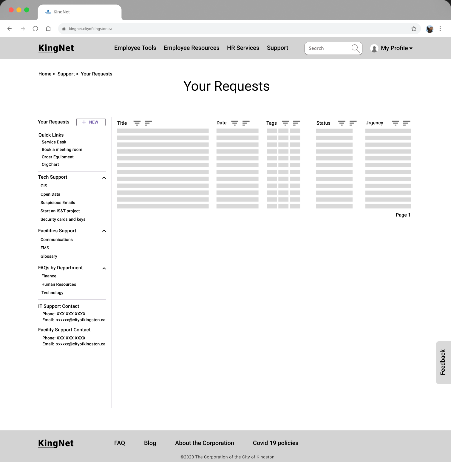
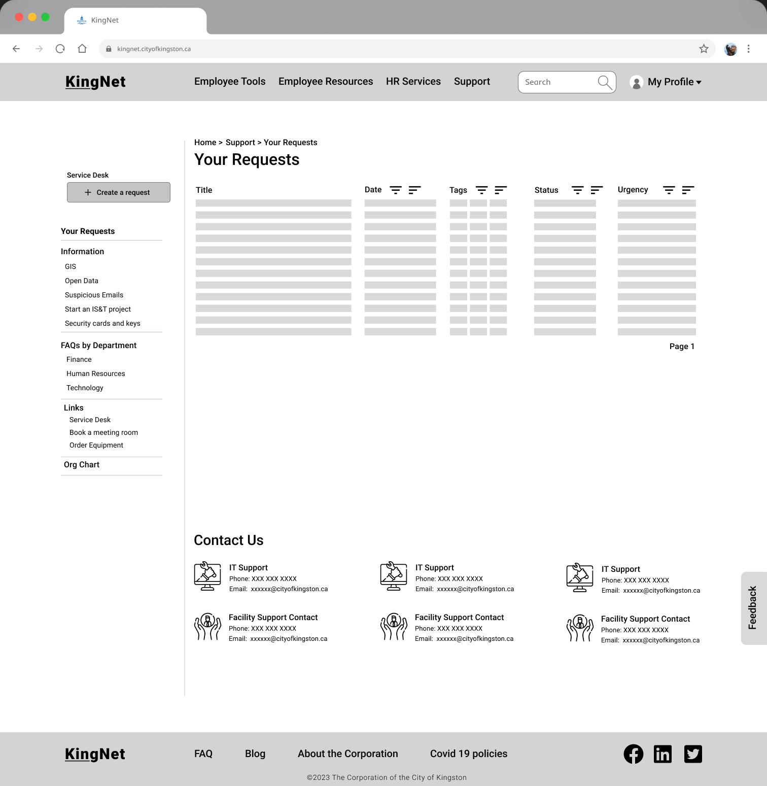
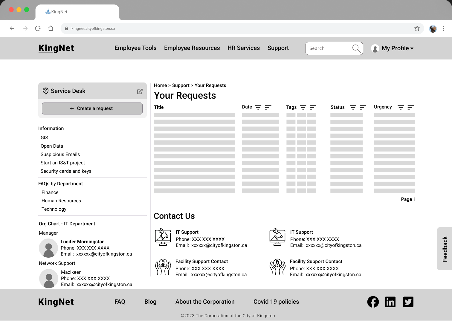
Your Requests Page
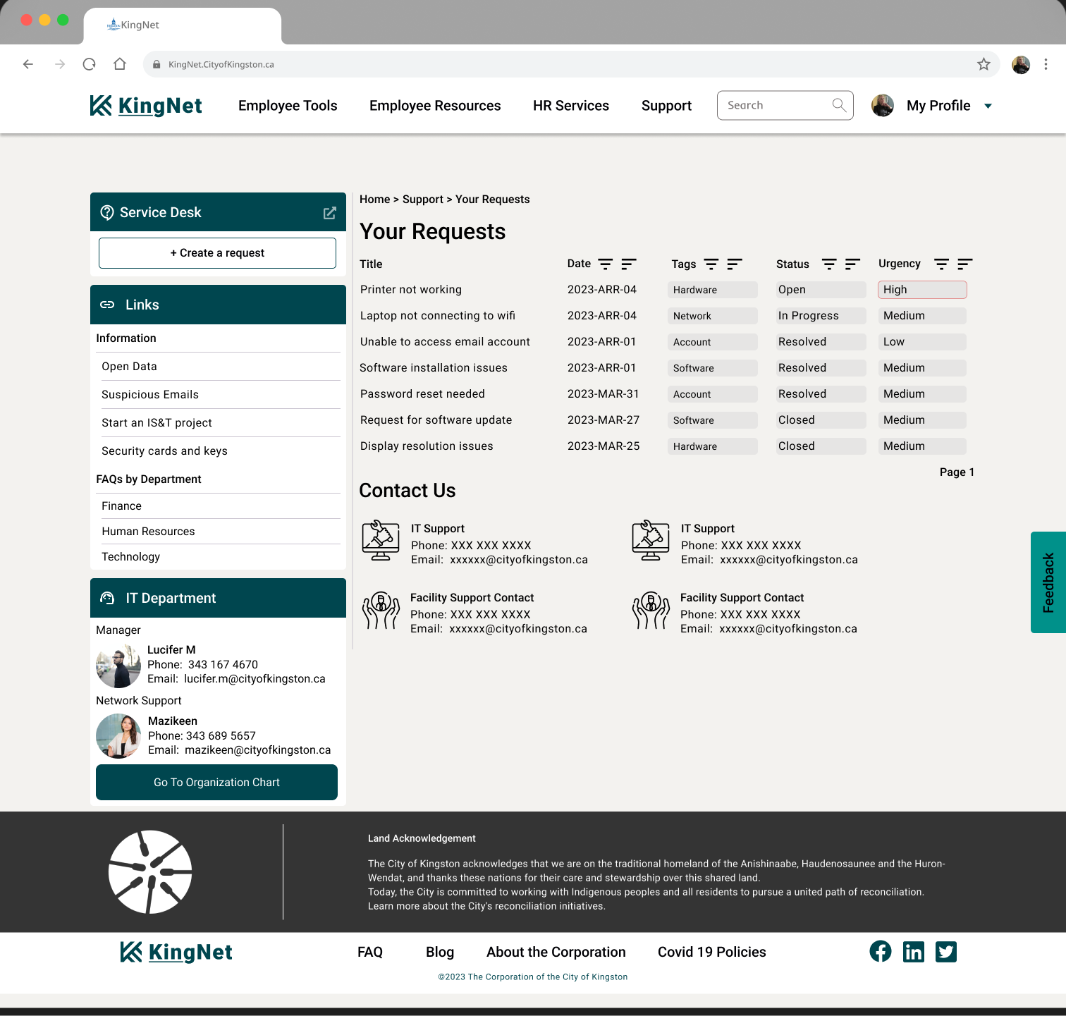 The ‘Your Request’ page is designed to allow users to track their service request history. It differentiates the information on the basis of dates, status and urgency of the request.
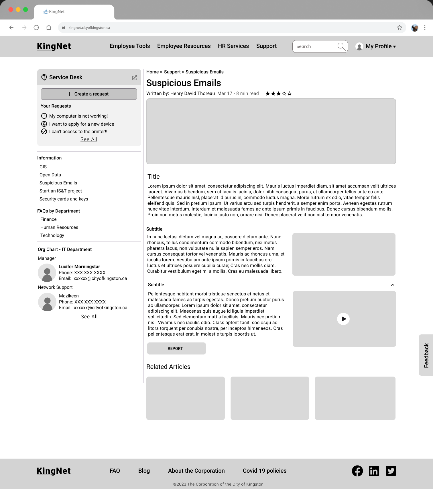
Article Page
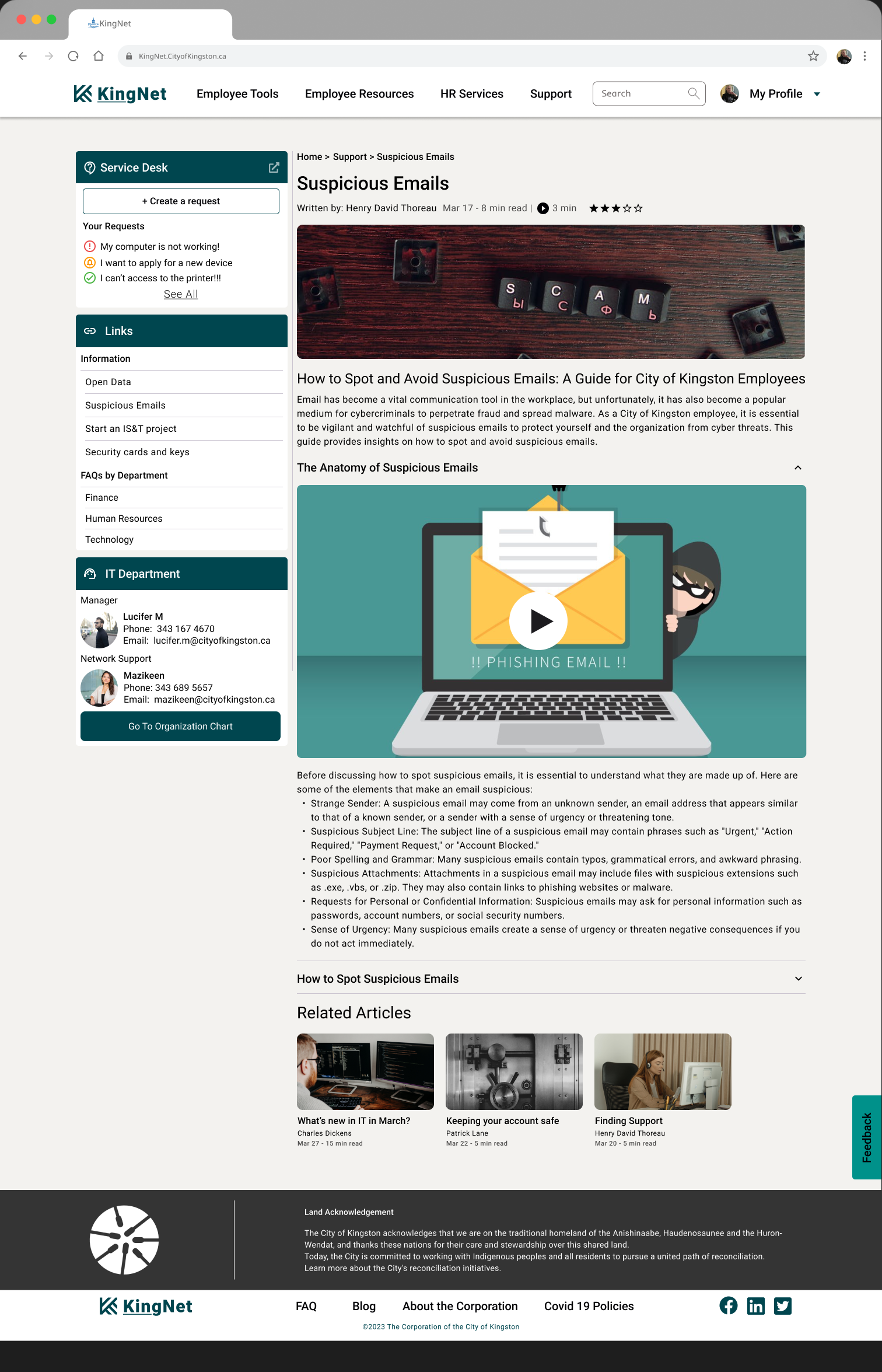
Article Information
Author
Estimated Reading Time
Available Media
Rating
The article page provides users with informative content in an easily digestible format. It includes information about the author, estimated reading time, available media, and a rating system. This information helps users to understand the relevance and importance of the content.
Multi Media Content
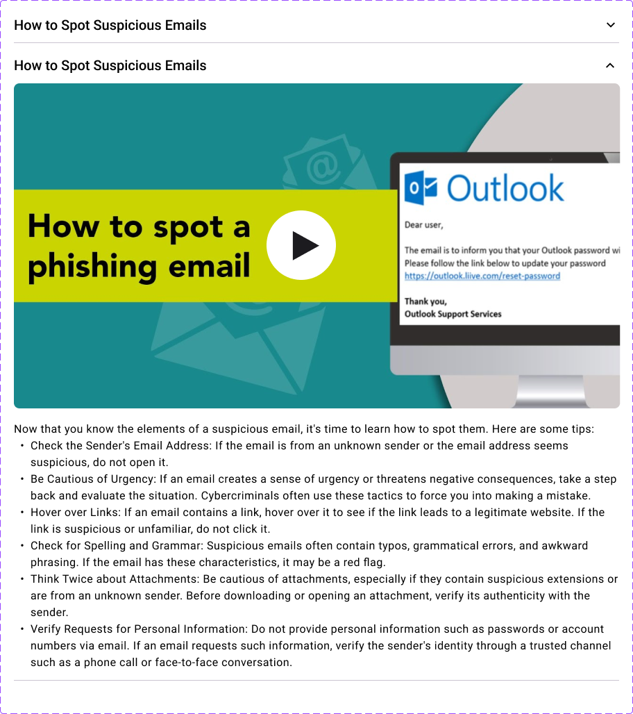
Multimedia content is provided in collapsible sub-sections, which allows users to quickly access the information they need. The layout is consistent with the support pages, which helps users to easily navigate through the content.
Related Articles
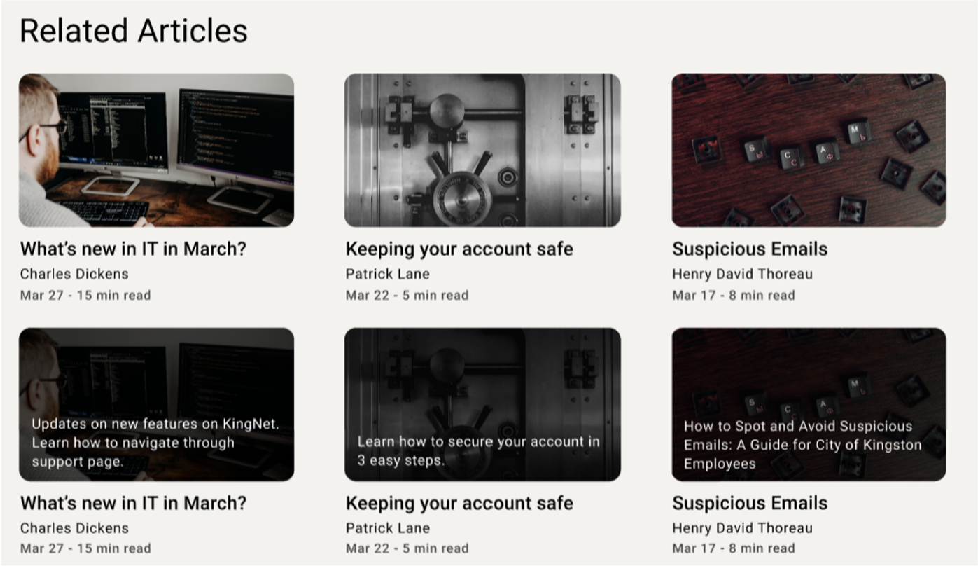
This feature of providing related articles is designed to increase user engagement with content and help them resolve issues that they are visiting the support page for.
Follow Up Steps
- Showcase to the client
- Further discussion with the client on the design
Client Feedback
- It confirms their thoughts about the directions of new KingNet
- It helps them to understand the employees’ needs, some of the results were not expected and surprised them, it reduce their biases and see there is a need of redesigning the KingNet
- They are happy with the new design especially the improved process of accessing the create request page which is one of the most used functions.
- The product owners are happy with the layout of the landing page which looks more modern, organised and clean.
Conclusion
I practised my skills on how to consolidate clients’ requirements and clarify concepts, analyze data from surveys, interviews, and feedback sessions, design a page from scratch, and make decisions based on business requirements and user expectations. During the user research phase, we discovered that different users had varying expectations from the website, the role and nature of employees affected their usage of KingNet significantly, and some functions were critical to users but not the business. I also gained good experience on leading the project along the way.
The most challenging aspect of the project was striking a balance between business requirements and user expectations, especially for frontline workers. However, we overcame the challenge by gathering as much information as we could from a single interview to improve our designs. To measure the success of the feature/product/initiative, we gathered feedback from stakeholders and employees on the design, layout, and process.
Overall, the aspect of the project that I enjoyed the most was analyzing feedback and incorporating it into the design to see how it improved from the initial stage. In future projects, I would approach user research by ensuring that all user groups are adequately represented and that their expectations are considered to strike a better balance between business and user requirements.
Reflection
- It was a group project, it would be better for me to breakdown the design into smaller pieces into small places instead of a big piece in one go.
- There were some limitations for data because of the meetings scheduling, we hope to get more feedback from frontline workers.
- The feedback section with the interviewees was not doing too well, I would have been more involved in the section and get better insights.
- We missed some of the deliverables in the evaluation phase, which is something we could improve.
- We did well in the design with limited input, the clients and interviewees were generally happy with the new design proposal.